Built to be remembered.
A curated graphic design portfolio featuring branding, music artwork, packaging, merchandise and visual communication. Each project has its own story, process and final outcome. Explore this graphic design portfolio to see how concepts are developed into polished visual work.
Graphic Design Portfolio
This graphic design portfolio brings together selected branding, packaging, music artwork, clothing and campaign projects, showing the creative process from initial concept through to final application.
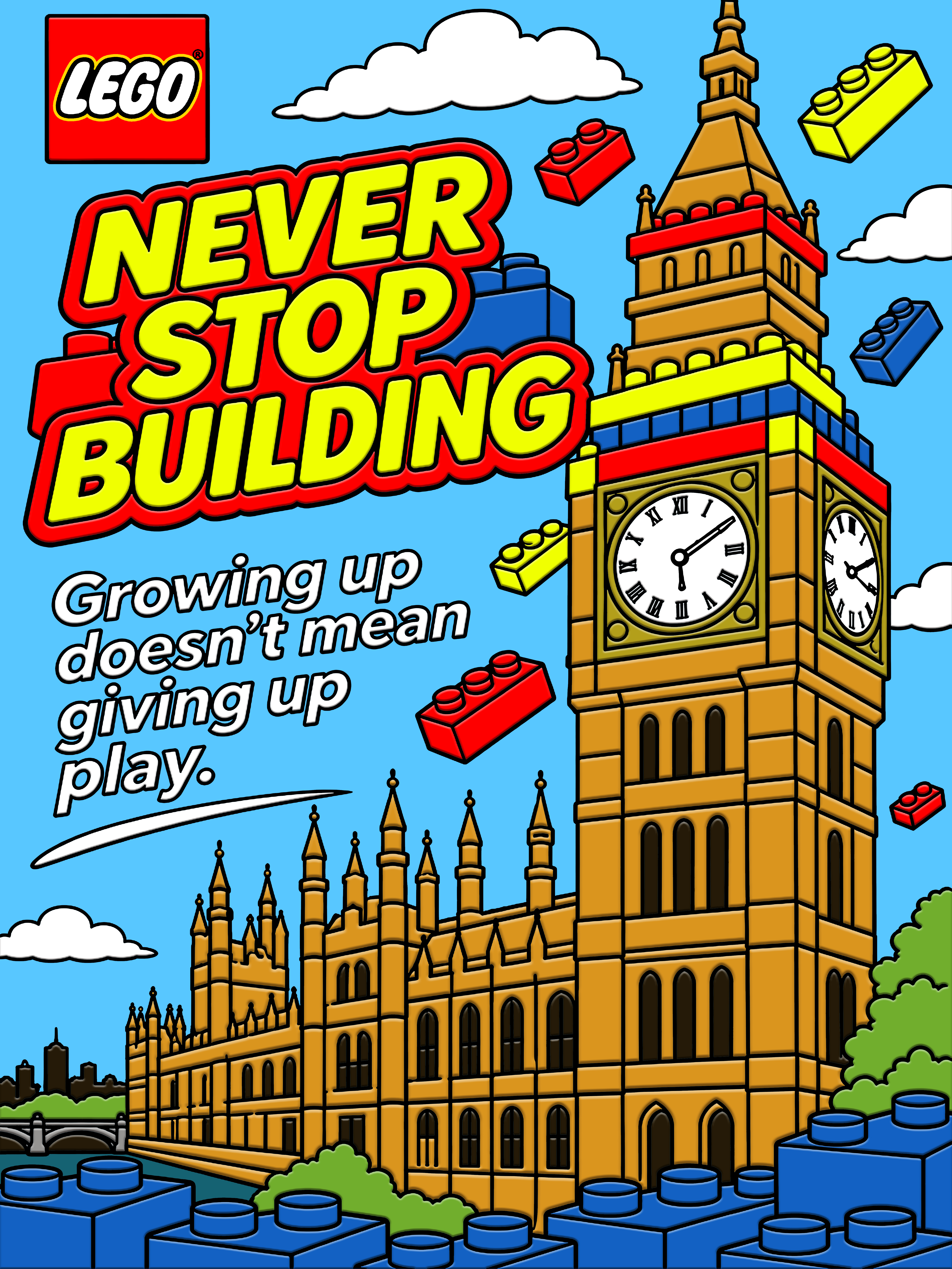
Power of Play
Three LEGO-inspired landmark posters about making time to play as adults.

The Rubbish Removal Company
A complete rebrand with a new logo and animated advert.
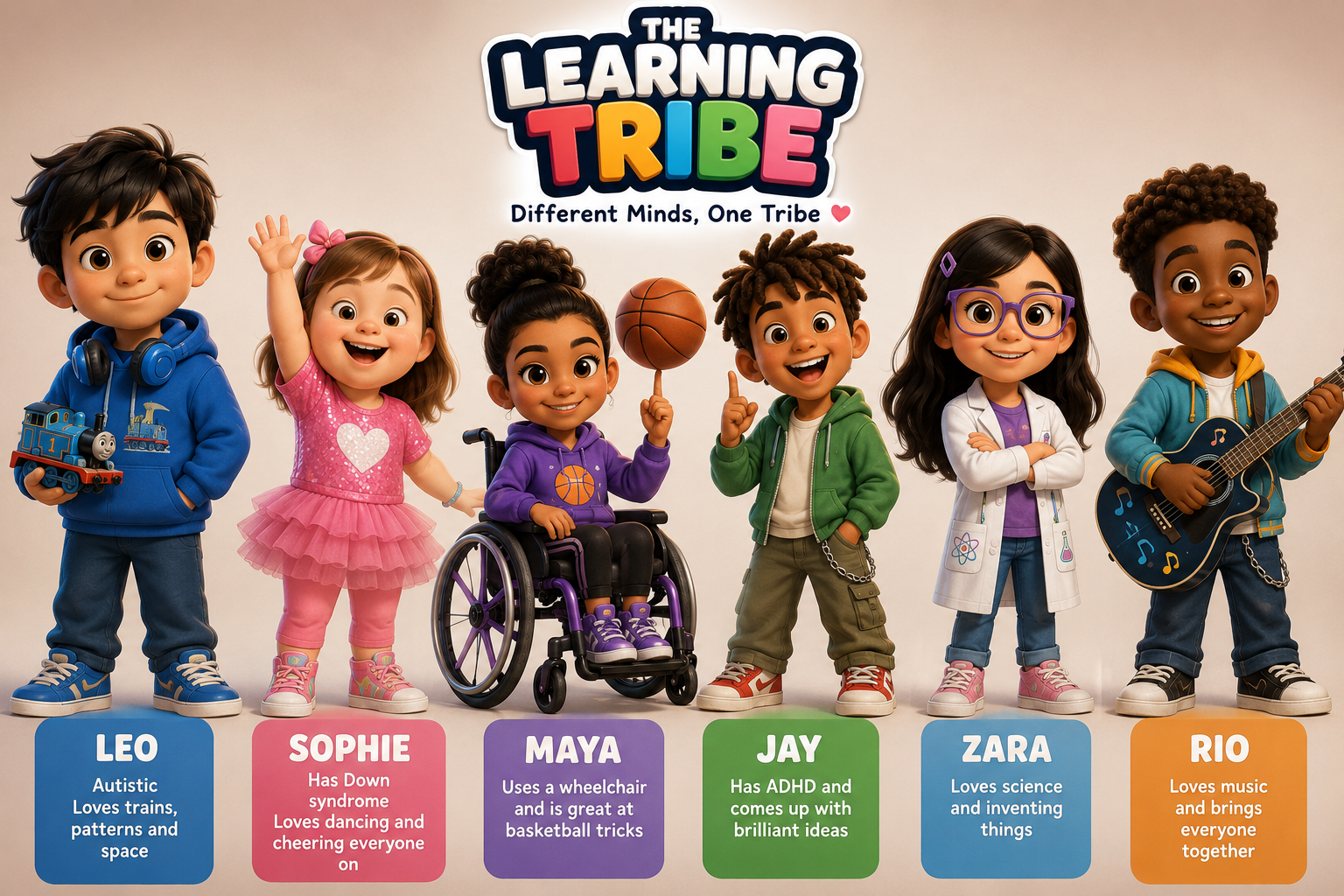
The Learning Tribe
An animated YouTube series celebrating children’s different abilities through relatable stories about inclusion.
Maison Celeste Skin
Complete branding for a luxury skincare salon in Mayfair, London. Elegant typography, cream and gold, with a brand presentation video.
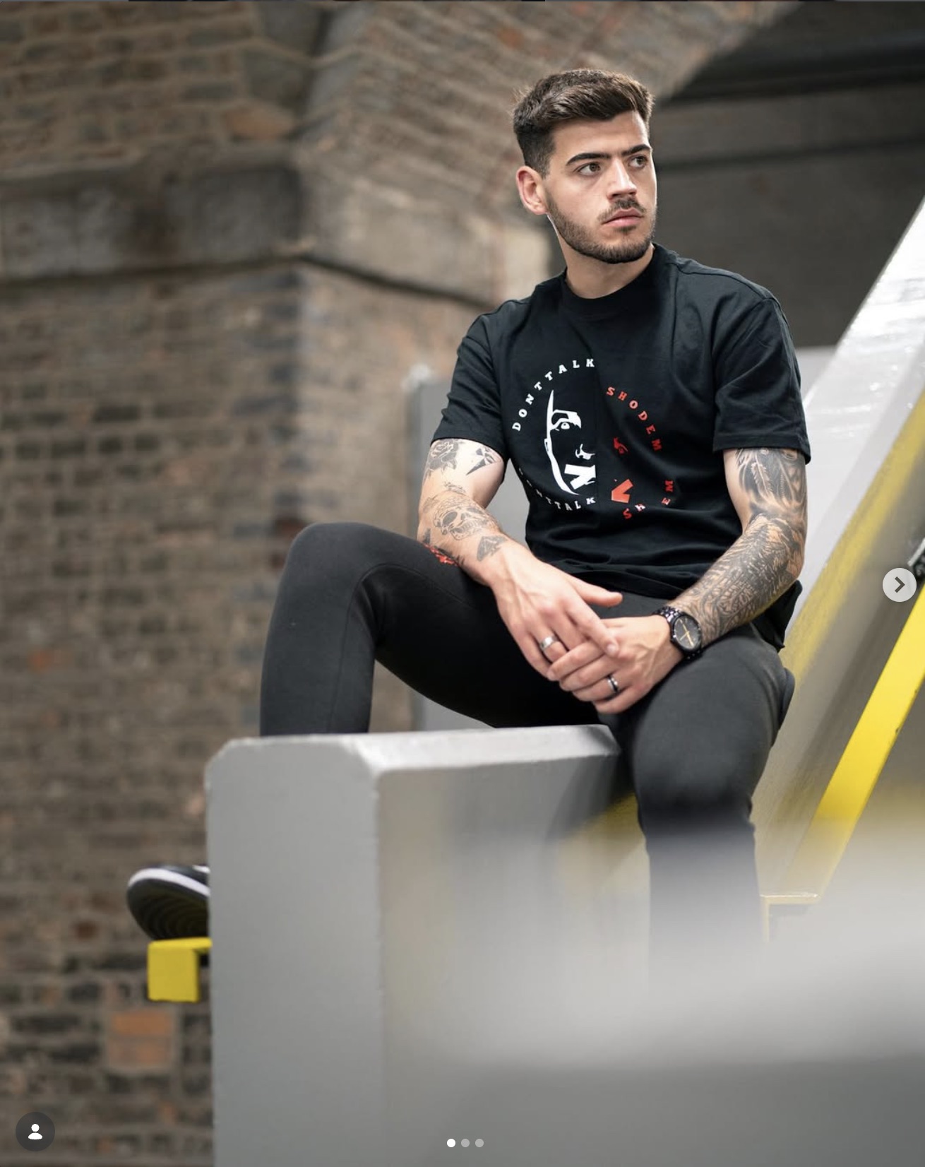
Donttalkshodem
Logo variations and expressive clothing graphics across T-shirts, hoodies, tracksuits and masks.

Reactoons & Bartoons
Co-founding Reactoons with Dale Green, illustrating characters and backgrounds, and bringing animated rap freestyles to life with Adobe Character Animator.
C.O.B.R.A. & NexGen Protection
A long-term design collaboration spanning child protection, women’s protection, anti-knife education, fitness, instructor branding and campaign communication.
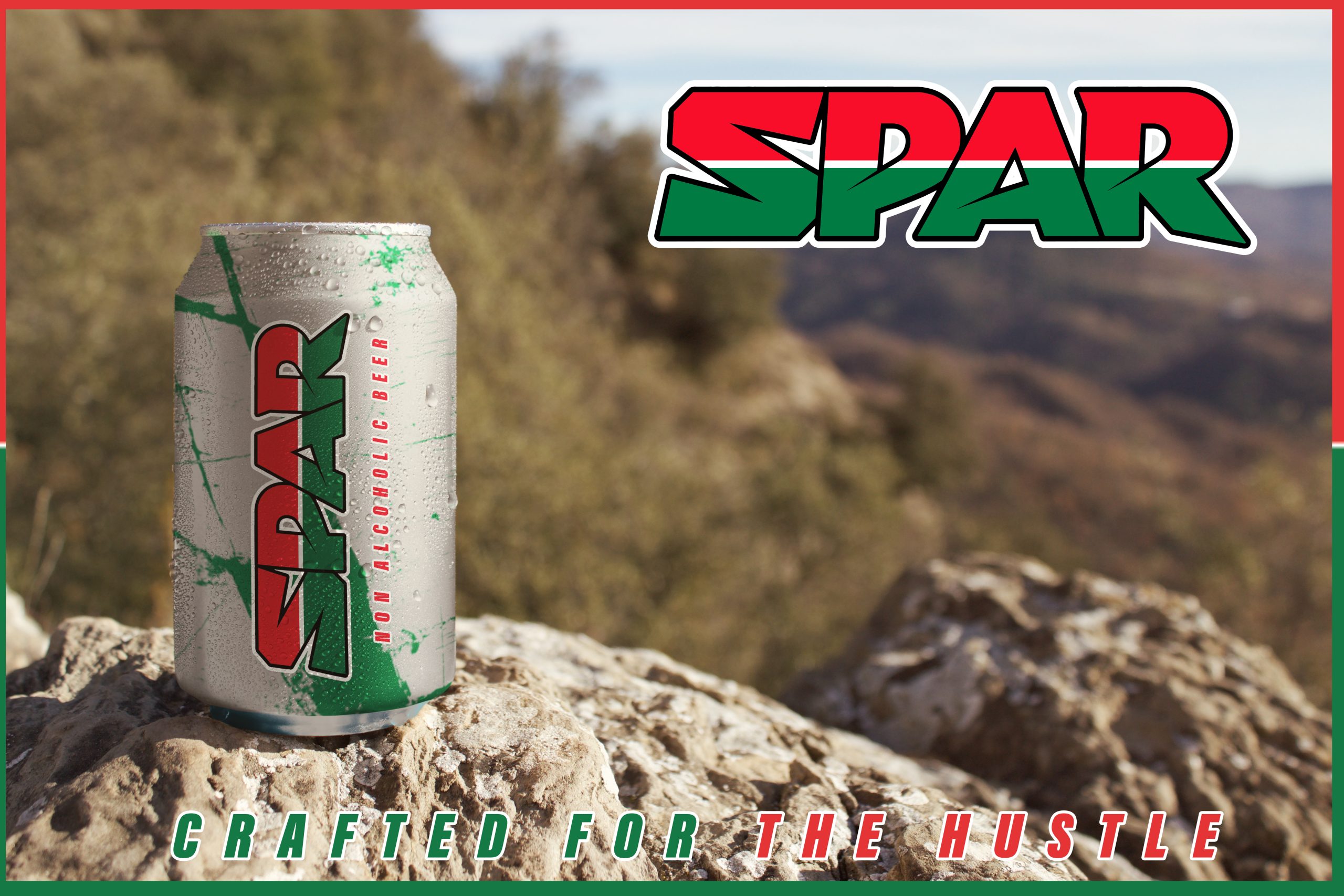
SPAR Refresh
A university branding project exploring a new visual identity for a SPAR non-alcoholic beer range and a Refresh Festival campaign concept for Hyde Park, London.
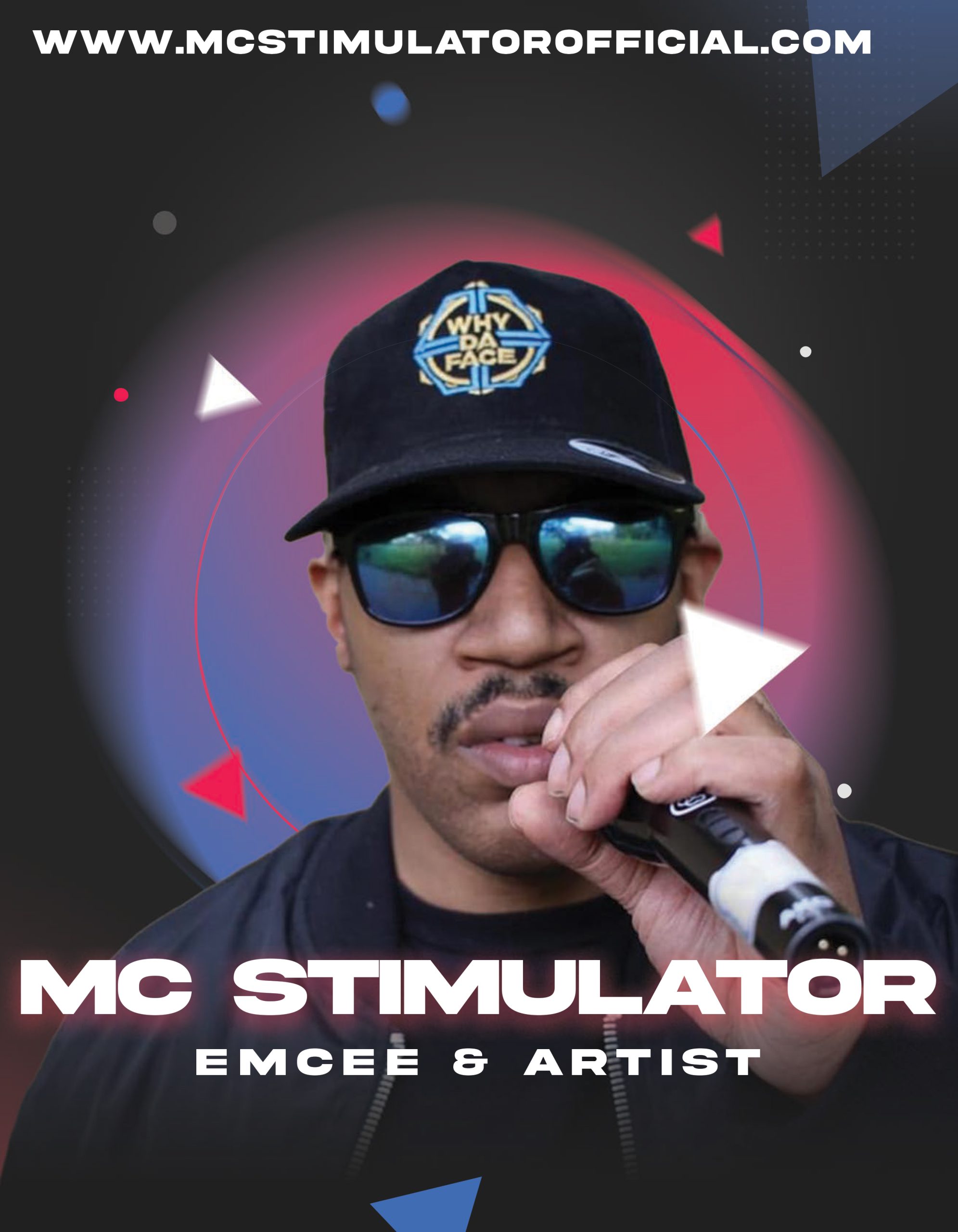
MC Stimulator
Artist identity, artwork and visual communication developed across the M.A.Designs portfolio.
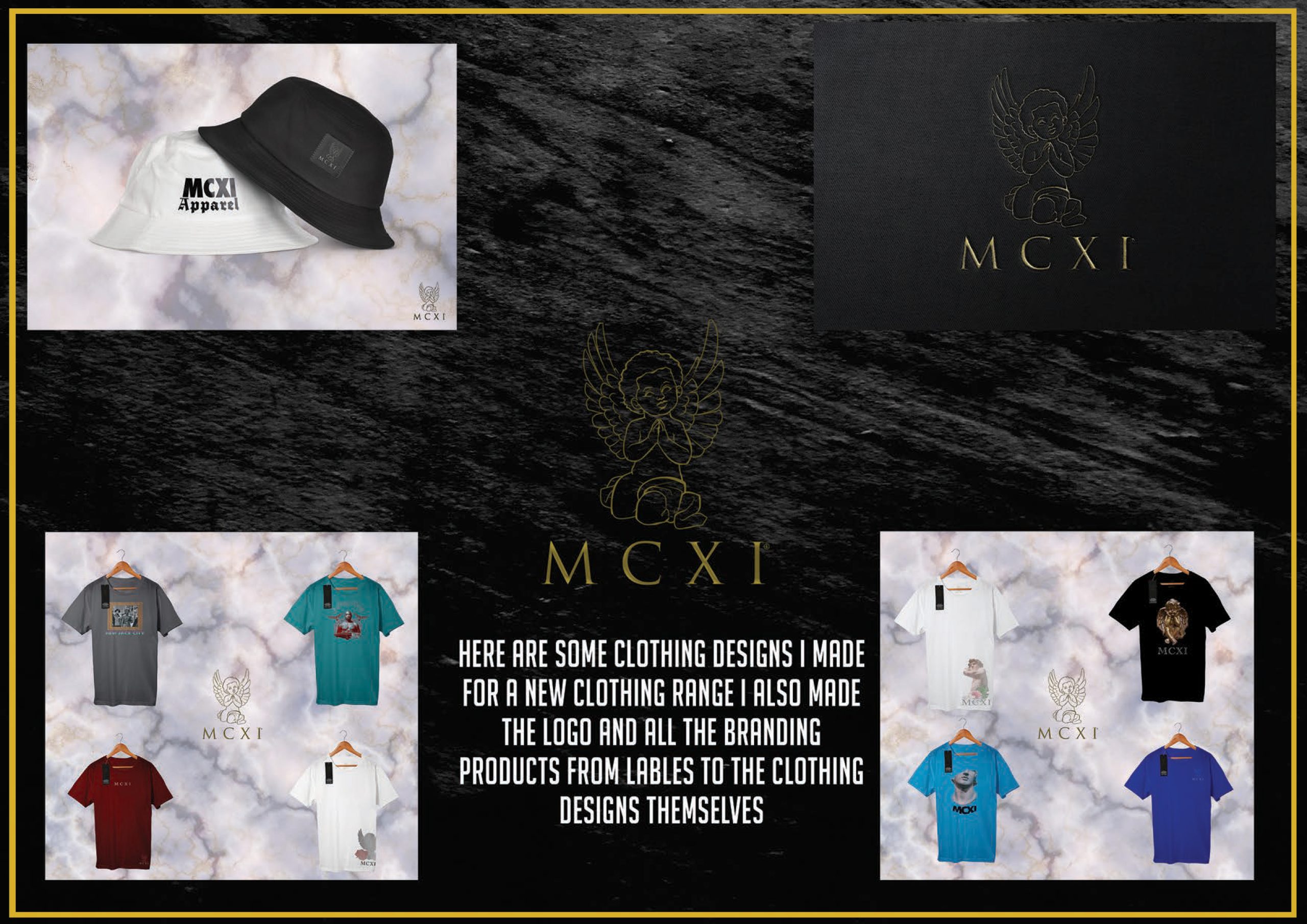
MCXI
A clothing identity developed through logo design, labels and apparel applications.
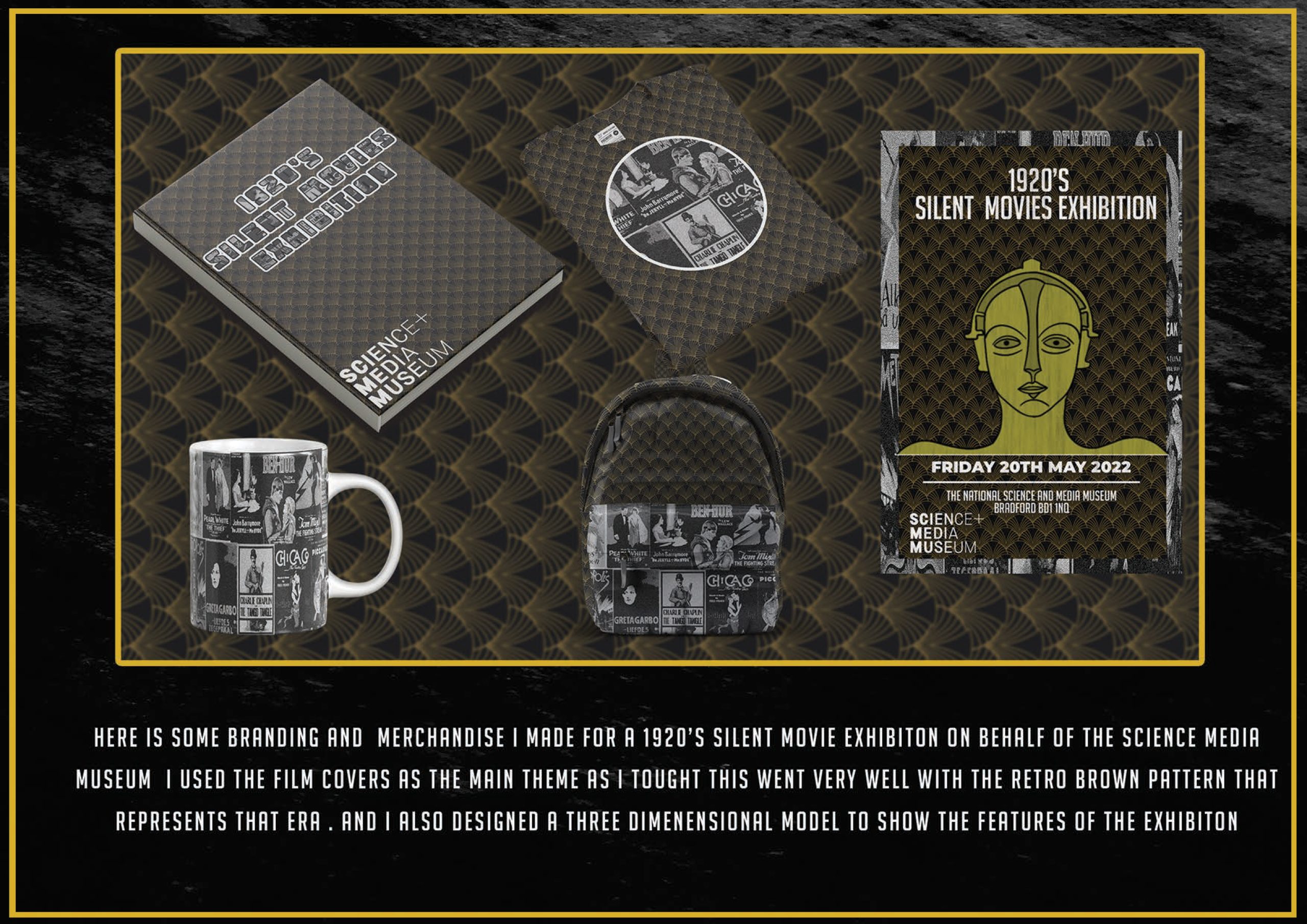
1920s Silent Movie Exhibition
A retro-inspired exhibition identity extended across print and merchandise.
View case study →
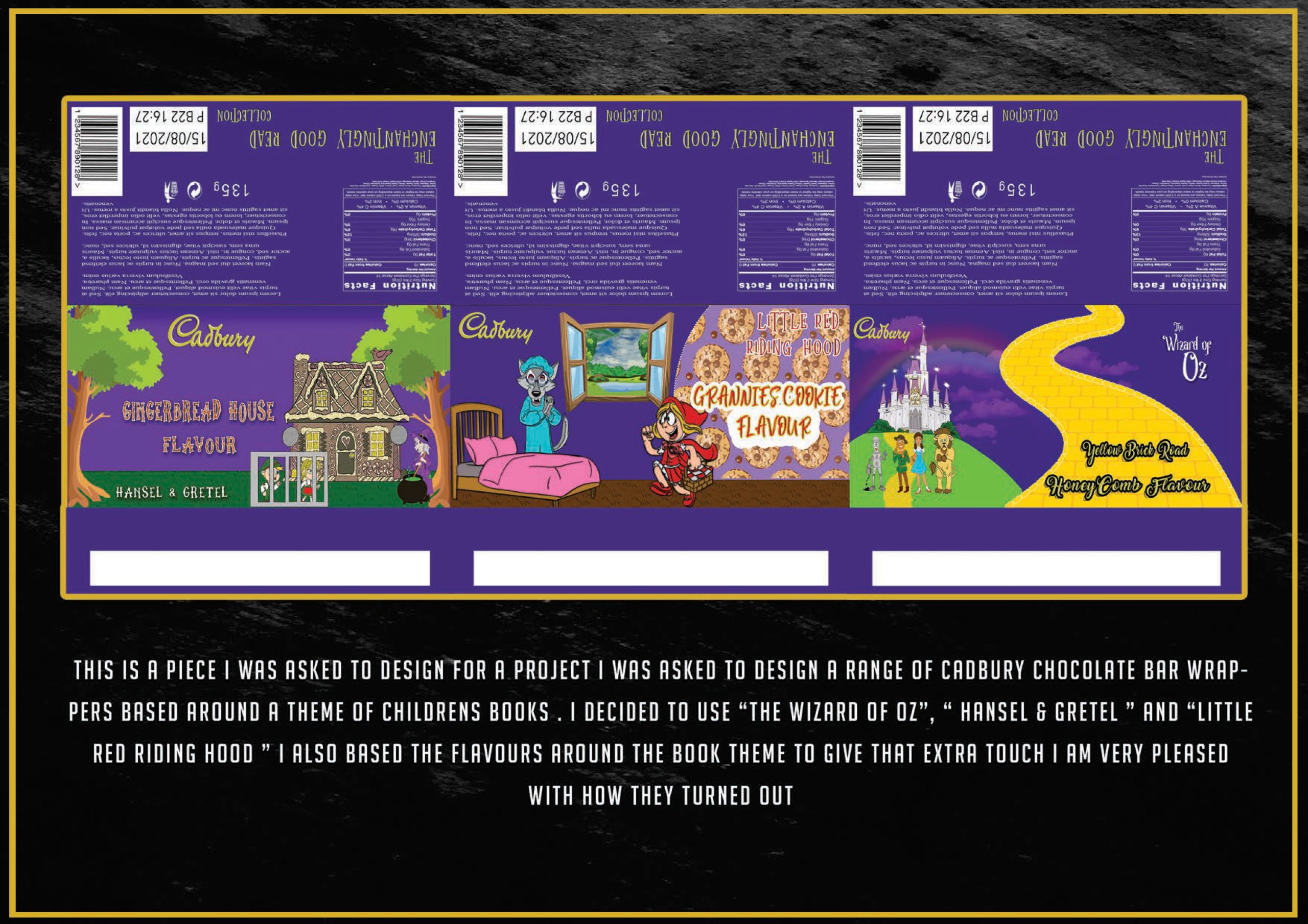
Cadbury Storybook Packaging
Packaging concepts inspired by classic stories including The Wizard of Oz, Hansel & Gretel and Little Red Riding Hood.
Sunnah Wear Logo Design
A dedicated case study exploring the creation of the Sunnah Wear emblem, monogram and premium fashion identity.
Logo & Identity Collection
A selection of logo and identity projects created for businesses, fashion brands, music ventures and other creative projects.
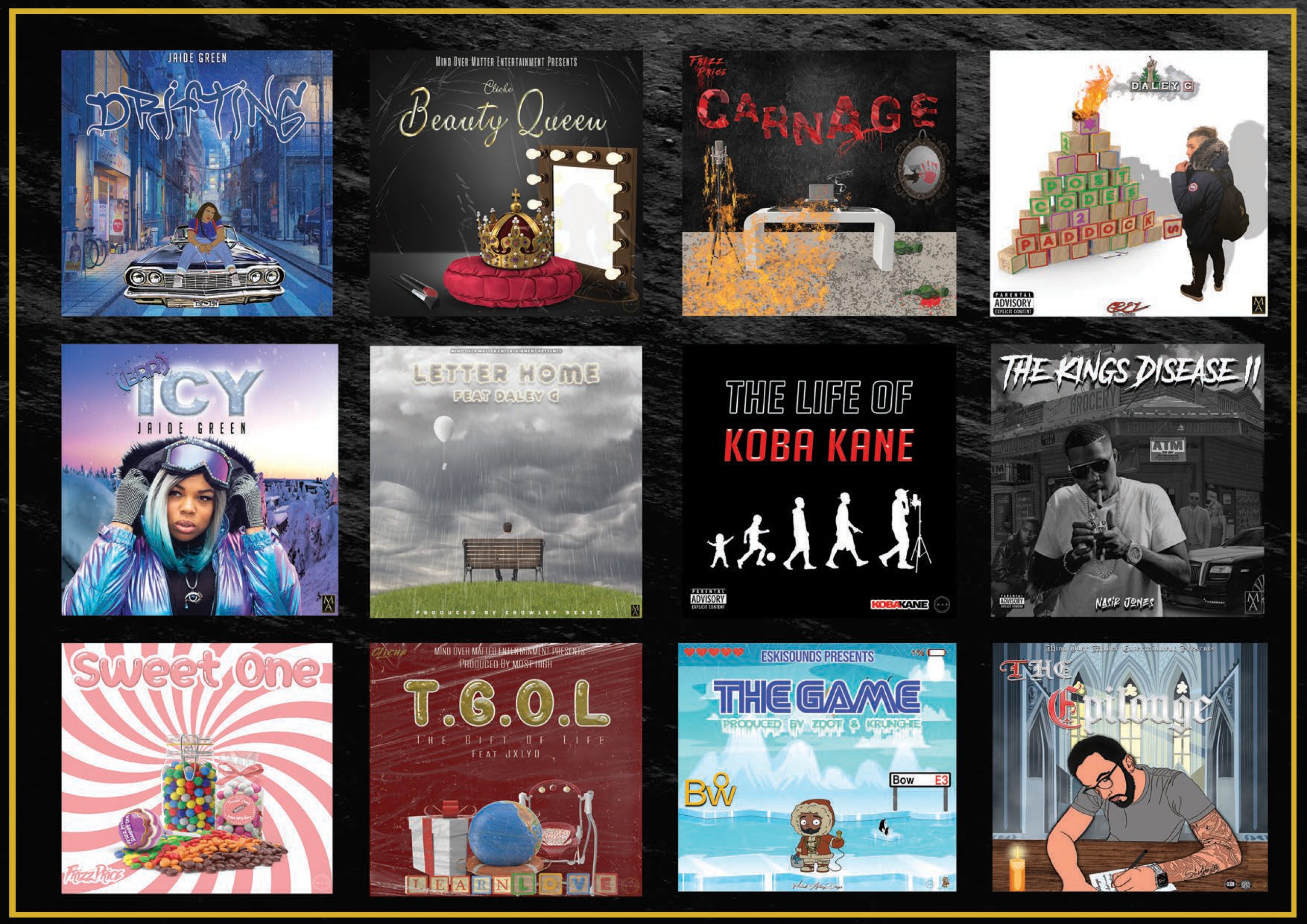
Album & Cover Artwork
Selected cover artwork created across music projects, artists and visual campaigns.
Cadbury Storybook Packaging
A packaging concept developed around classic children’s stories, combining illustration, flavour concepts and a strong visual storytelling approach.
Reimagining Cadbury through children’s stories.
The project asked for a range of Cadbury chocolate bar wrappers based around a children’s-book theme.
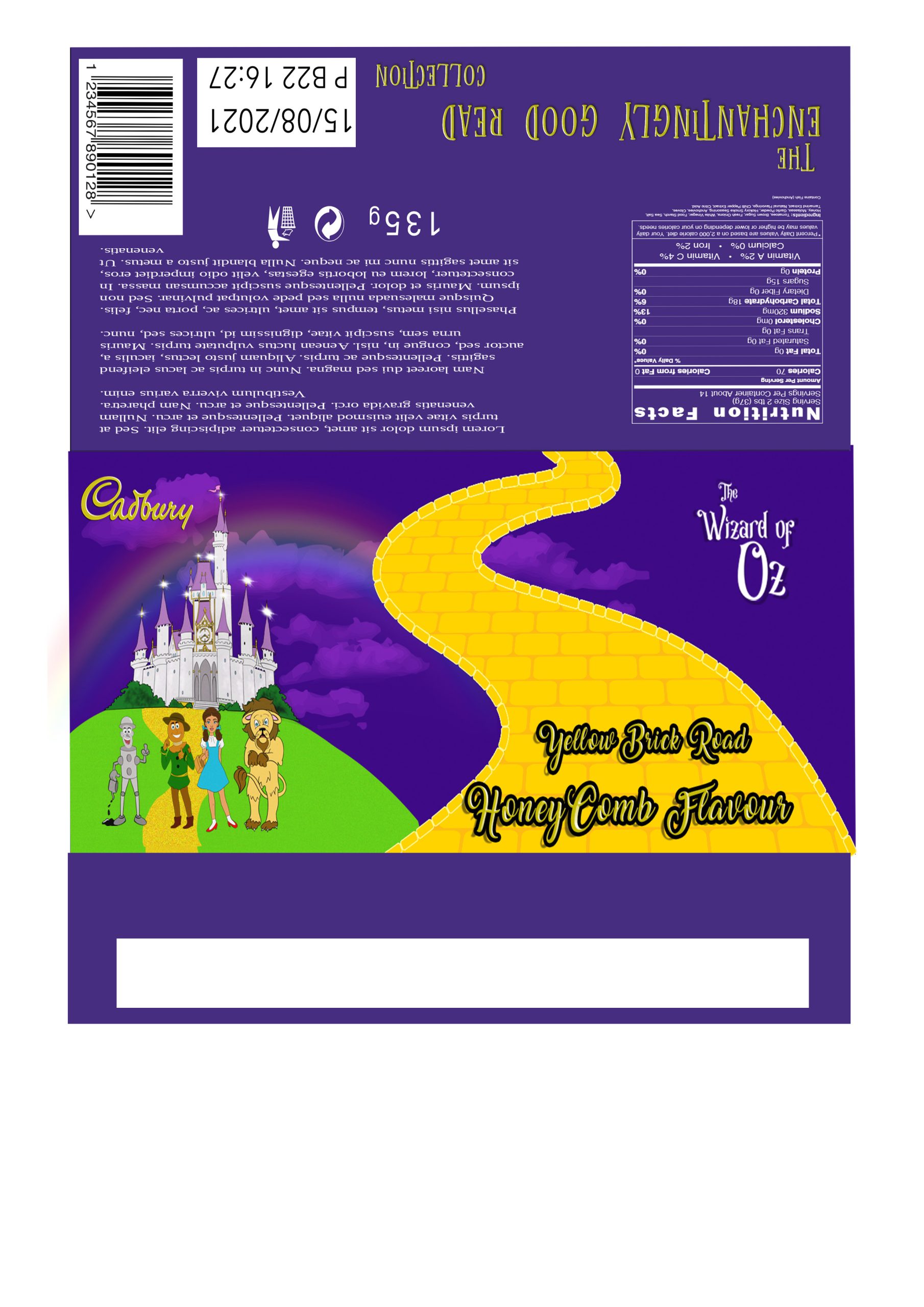
The concepts explored The Wizard of Oz, Hansel & Gretel and Little Red Riding Hood, with each wrapper given its own flavour concept.
Storytelling through packaging.
The visual direction combines illustrated scenes, character-led storytelling and playful typography to translate familiar story worlds into a cohesive Cadbury packaging range.
A complete wrapper range.
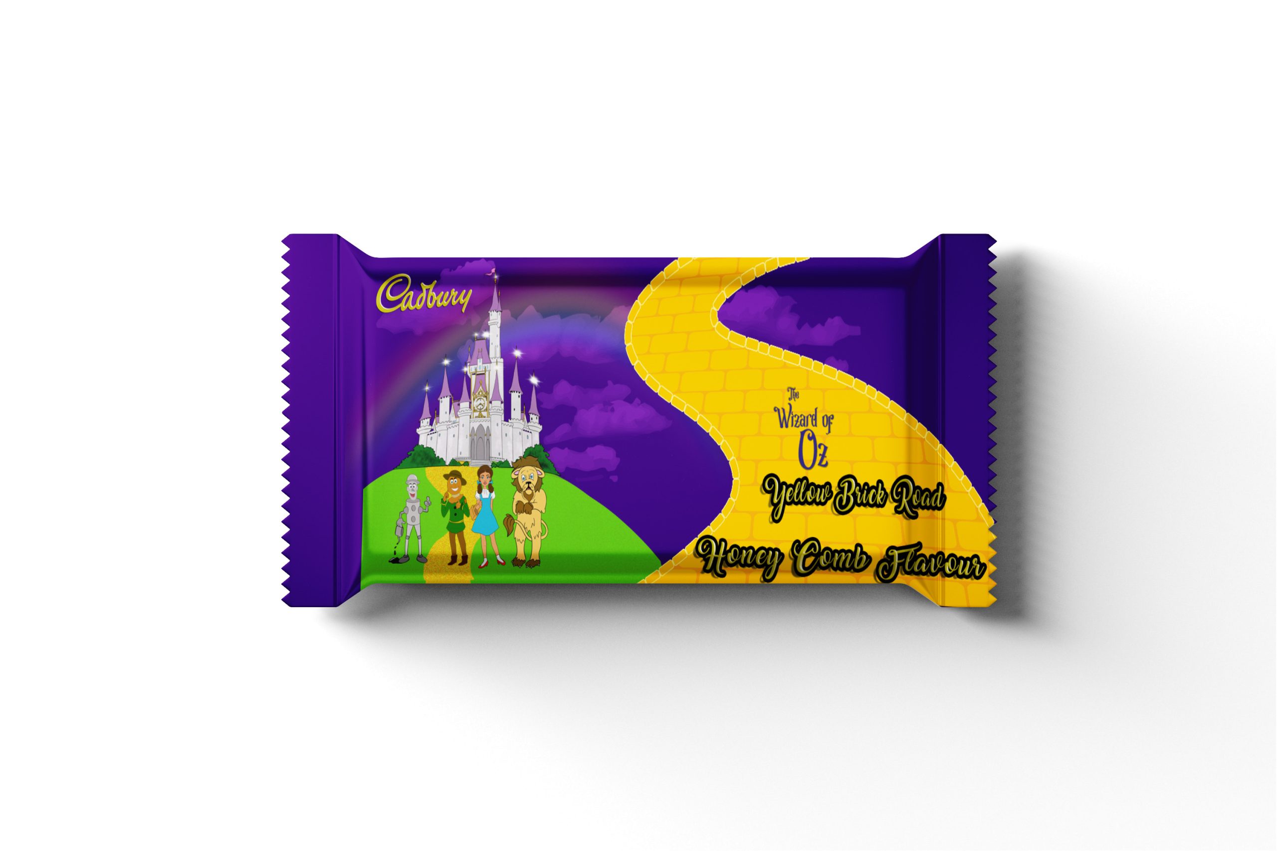
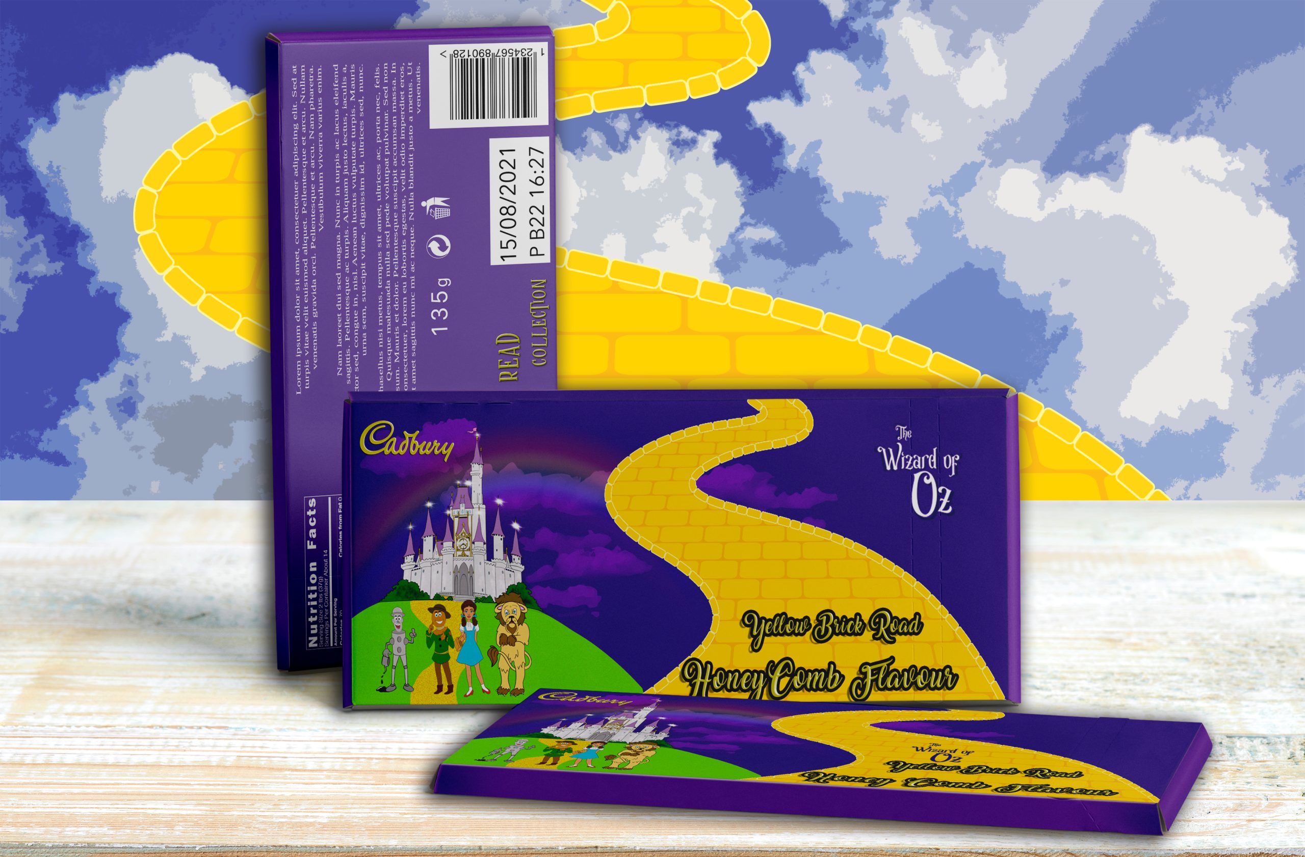
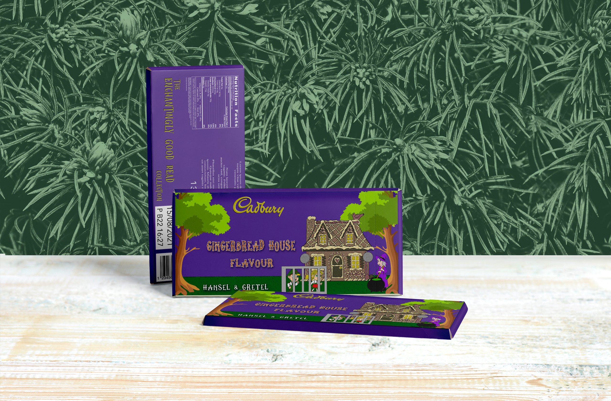
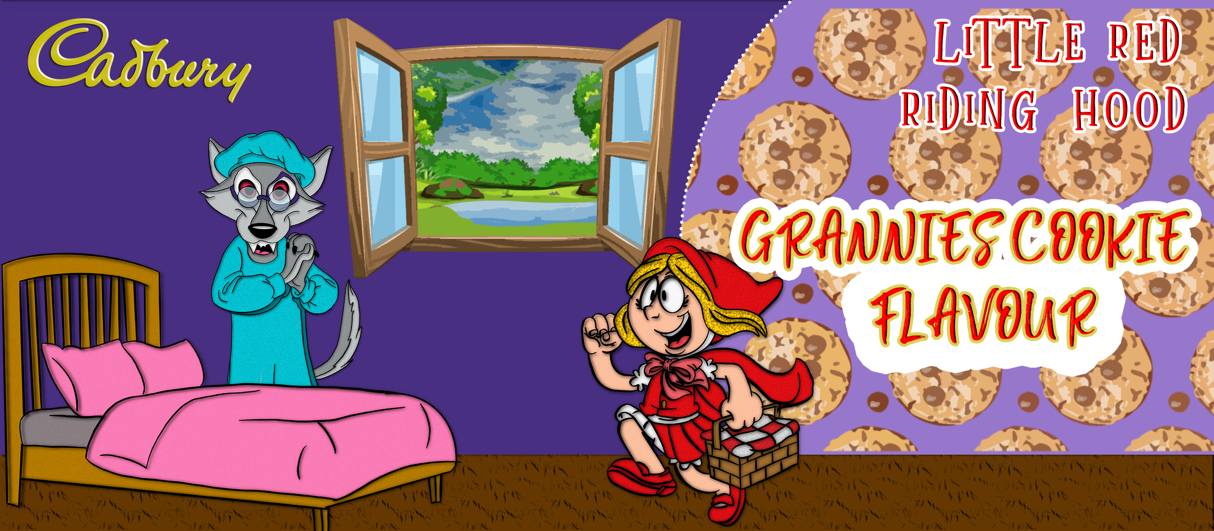
The final presentation brings the three concepts together as a unified packaging collection, with the artwork extended across the wrapper structure and presented as a finished retail concept.
Brand: Cadbury
Industry: Food & Packaging
Services: Packaging Design · Illustration · Concept Development · Visual Communication
Studio: M.A.Designs Ltd
Album & Cover Artwork
A collection of music artwork developed across different artists, releases and visual concepts, using imagery, typography and illustration to give each project its own identity.
Creating artwork with its own identity.
The work spans a range of music projects, with each cover developed to communicate the individual artist, release and concept through a distinctive visual direction.
Different styles, one design approach.
The collection explores illustrated artwork, cinematic photography, typography-led compositions, character imagery and experimental visual treatments. Each piece is designed around the story and personality of the release.
From concept to finished cover.
The portfolio brings together covers including Drifting, Beauty Queen, Carnage, The Life of Koba Kane, The King’s Disease II, Sweet One, T.G.O.L, The Game and The Culture.
Industry: Music & Entertainment
Services: Album Artwork · Cover Design · Typography · Illustration · Visual Direction
Studio: M.A.Designs Ltd
Logo & Identity Collection
A selection of identity projects created across fashion, beauty, music and creative ventures. Each mark was developed to give the brand a distinctive visual starting point.
From emblematic marks and elegant wordmarks to character-led identities, this collection shows the range of visual directions developed by M.A.Designs Ltd.
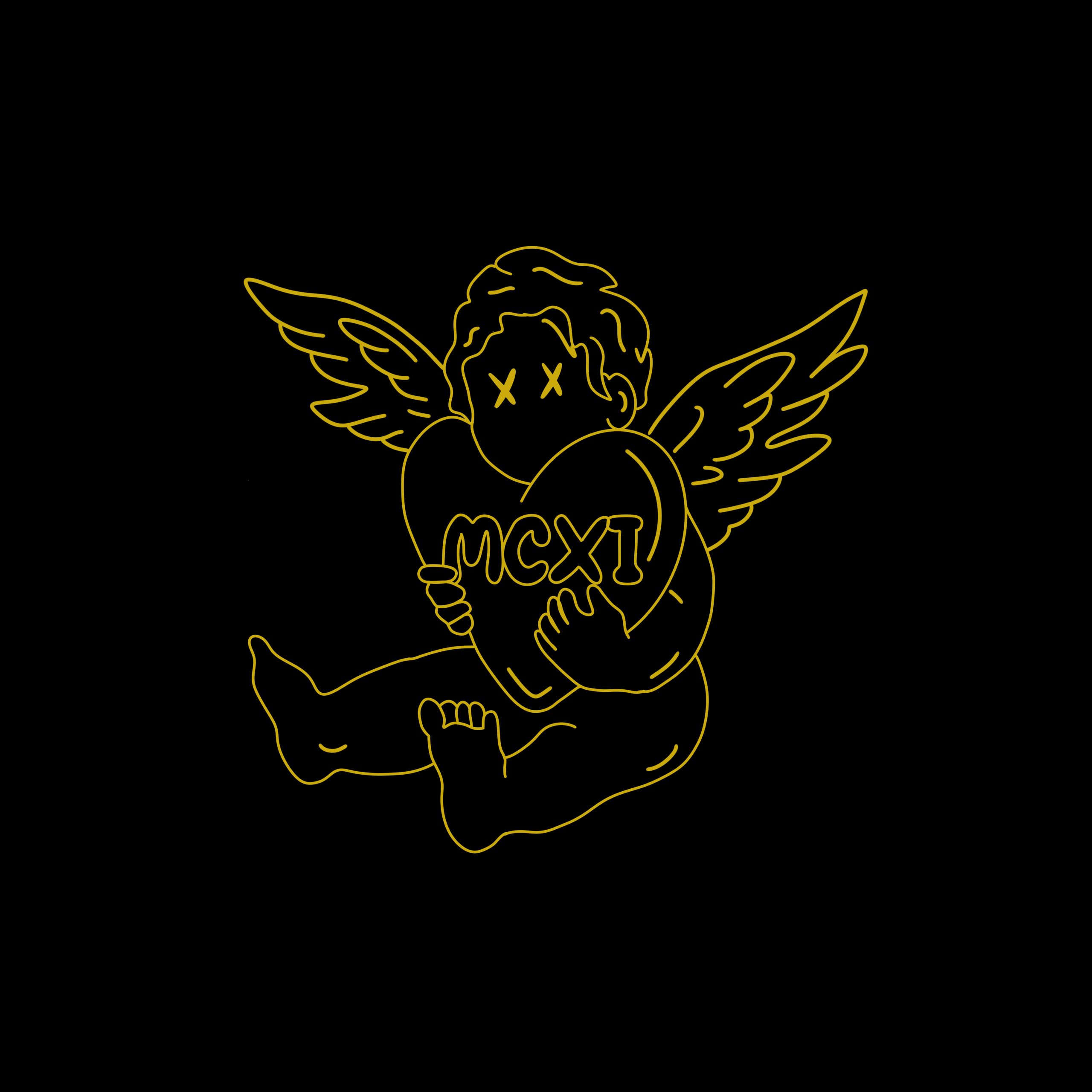
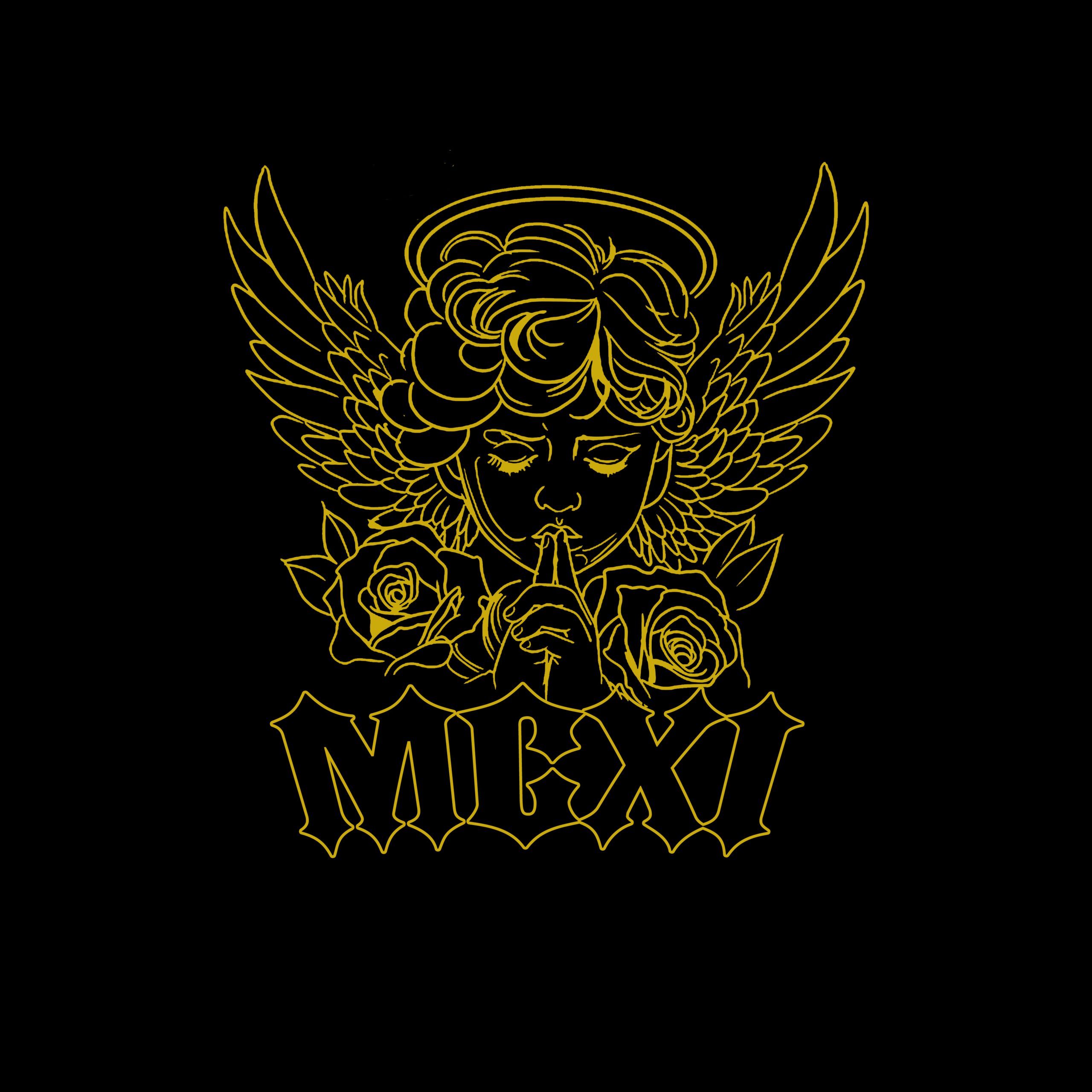

Logo Design · Brand Identity · Visual Direction · Apparel Identity
M.A.Designs Ltd
MCXI — Clothing Brand Identity
A complete visual identity developed for a new clothing range, covering the brand mark and its application across apparel and supporting clothing elements.
Building a recognisable clothing identity.
The project focused on creating the MCXI logo and developing a consistent visual identity that could be applied across a new clothing range.
Identity through application.
The final presentation brings together the MCXI logo, bucket hats, T-shirts and clothing branding, showing how the identity works across different apparel applications.
Client: MCXI
Industry: Fashion & Apparel
Services: Brand Identity · Logo Design · Apparel Branding · Clothing Design
Studio: M.A.Designs Ltd
MC Stimulator
Building a visual world around an artist.
A body of artist branding, music artwork, promotional design and campaign visuals created to give MC Stimulator a flexible visual language across releases, collaborations and digital content.
Bringing the artist’s identity to life.
A video created by M.A.Designs Ltd for MC Stimulator, extending the visual identity into motion and giving the campaign another layer of storytelling.
The Brief
MC Stimulator is a multi-genre musical artist with a long-standing presence across live performance, radio and music projects. The press kit presents a career spanning around 20 years, with work across numerous venues and radio platforms, alongside official videos, releases and promotional material.
The brief was to create a distinctive visual language capable of supporting the artist’s music, releases, collaborations and promotional campaigns while allowing each individual project to have its own visual identity.
Creative Direction
The creative direction moves deliberately between cinematic realism, urban illustration, conceptual storytelling, high-energy entertainment graphics and darker psychological themes. Rather than forcing every release into one visual style, each campaign is developed around its own subject, mood and message.
Recurring principles include strong typography, dramatic composition, character-led imagery, controlled colour palettes, cinematic lighting and recognisable MC Stimulator branding. This creates flexibility while maintaining a clear connection between the different pieces.
The Campaigns
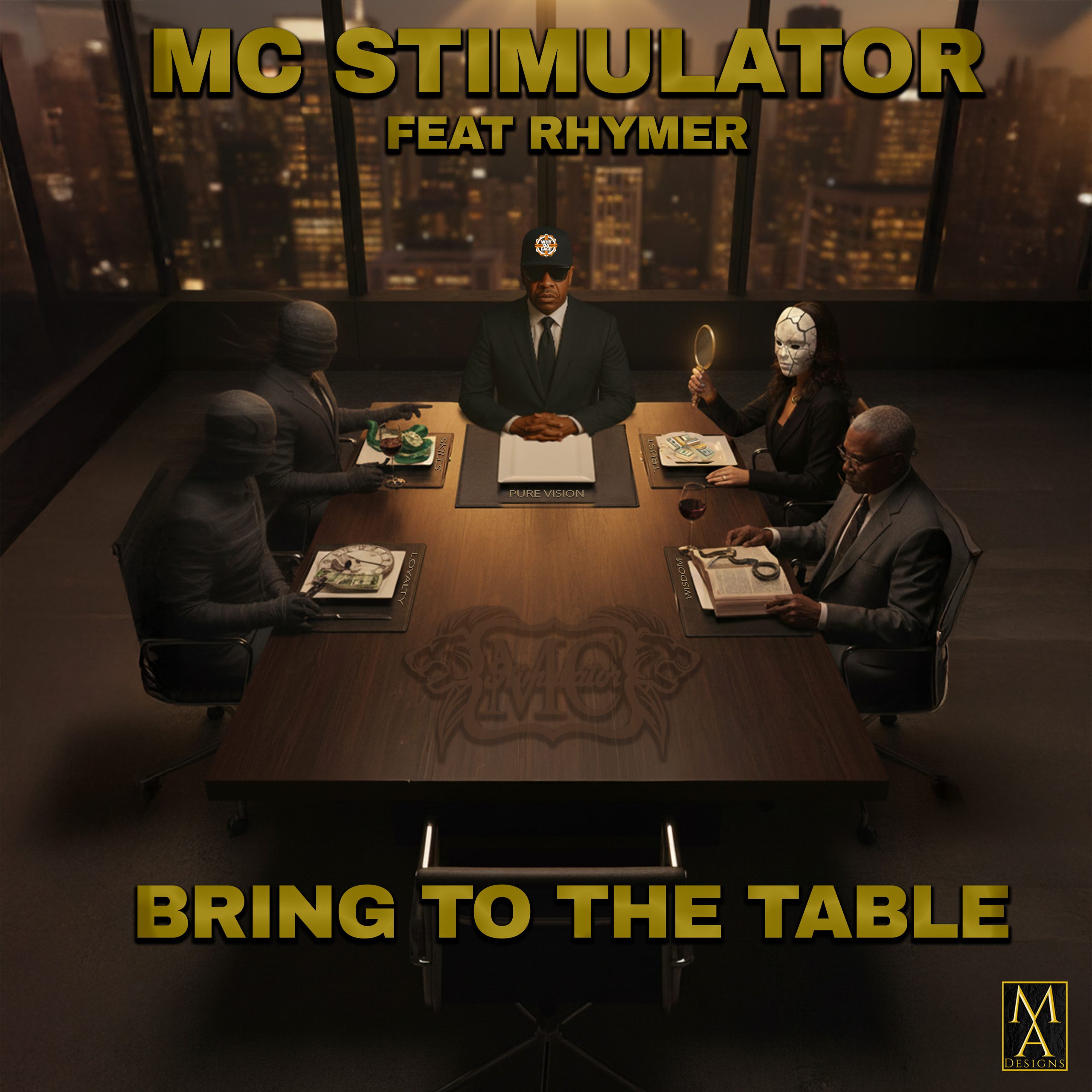
Bring to the Table
A dark, cinematic boardroom concept built around power, observation, loyalty, wisdom and decision-making, with gold typography reinforcing the premium visual treatment.
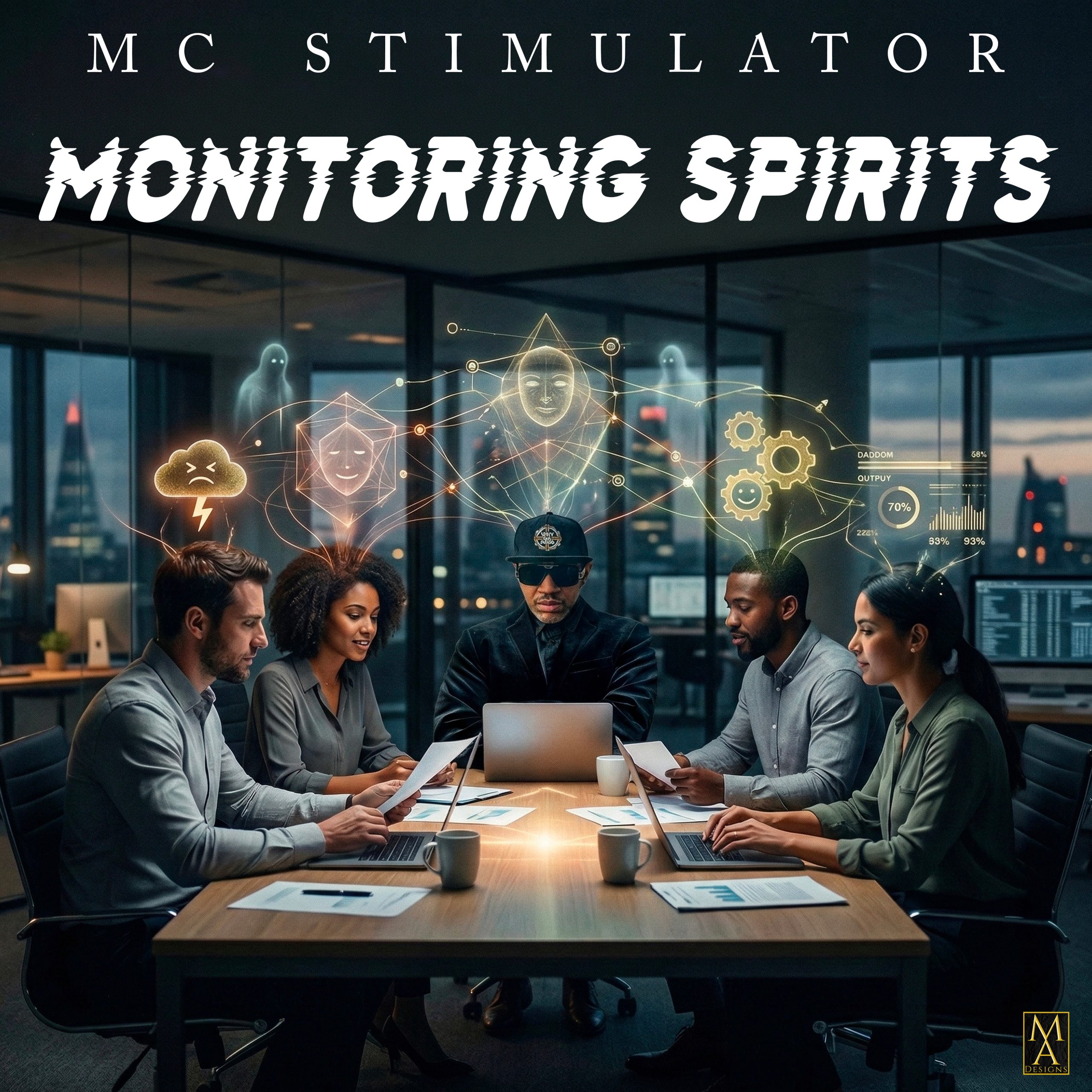
Monitoring Spirits
A surveillance-inspired visual world combining an office setting with symbolic spirits, technological graphics and layered conceptual imagery.
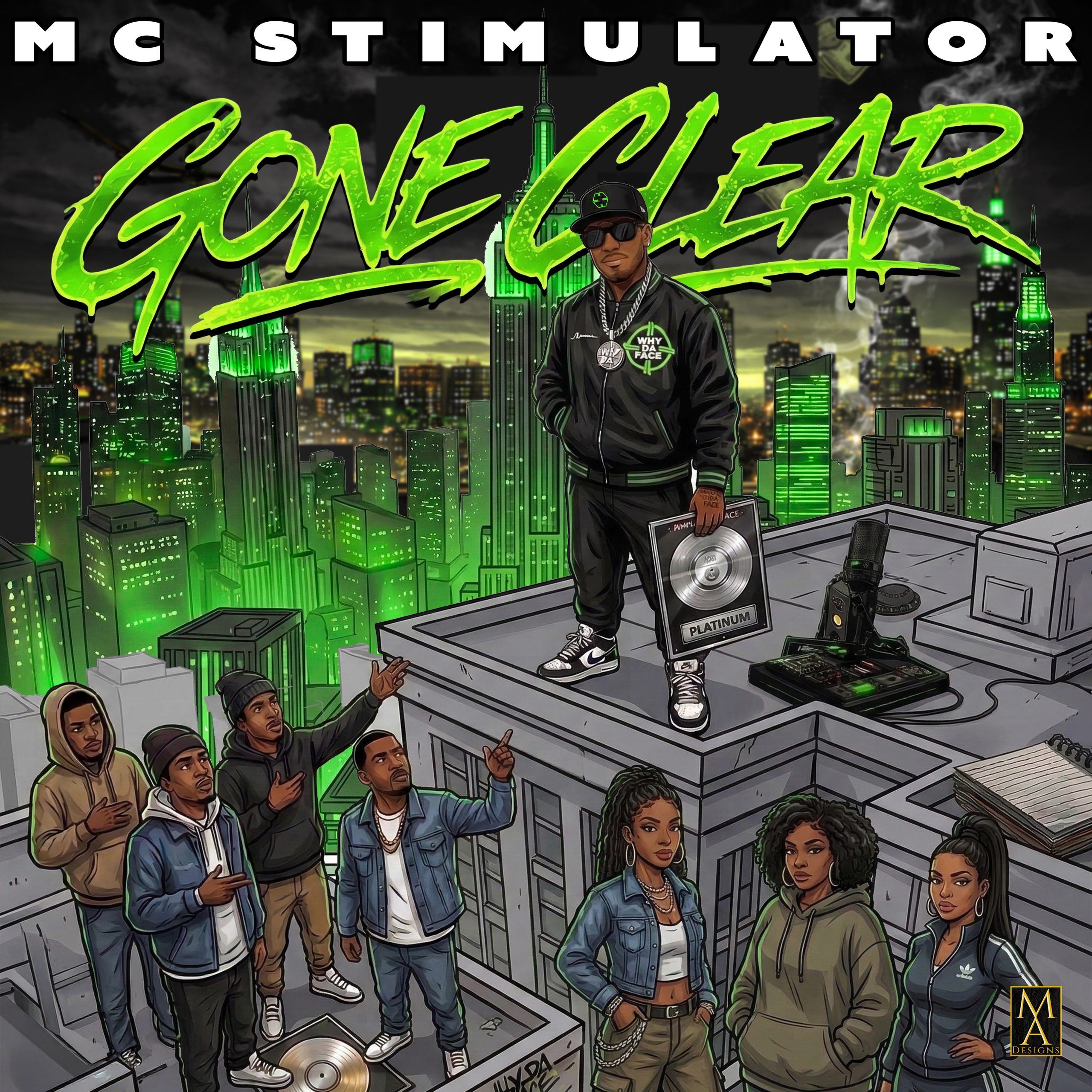
Gone Clear
An illustrated urban campaign using neon green, a city skyline, rooftop performance imagery and comic-book styling to create a bold release identity.
No Mercy
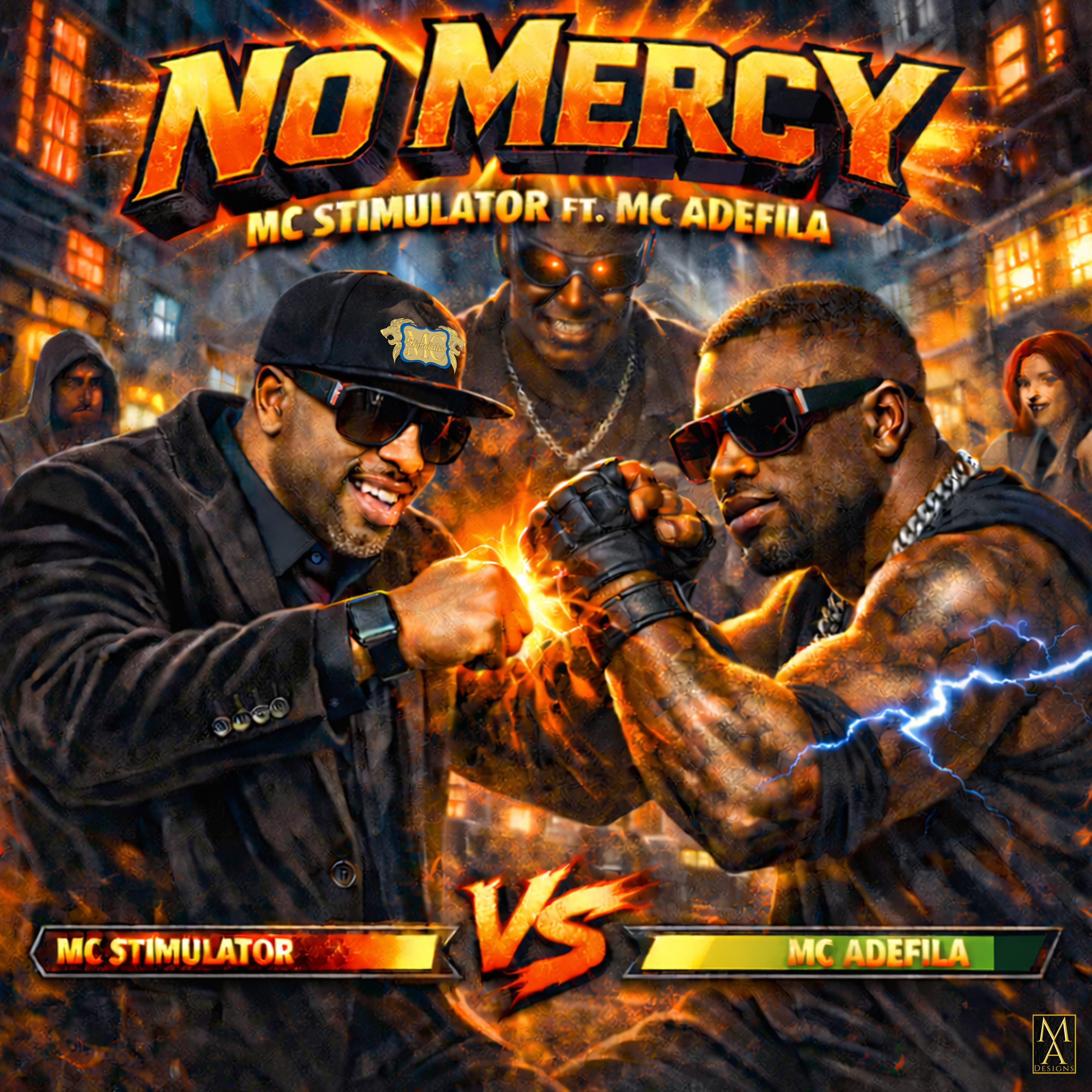
A collaboration visual built around MC Stimulator and MC Adefila, using fire, electricity, dramatic characters and fight-poster visual language.
Still Observing
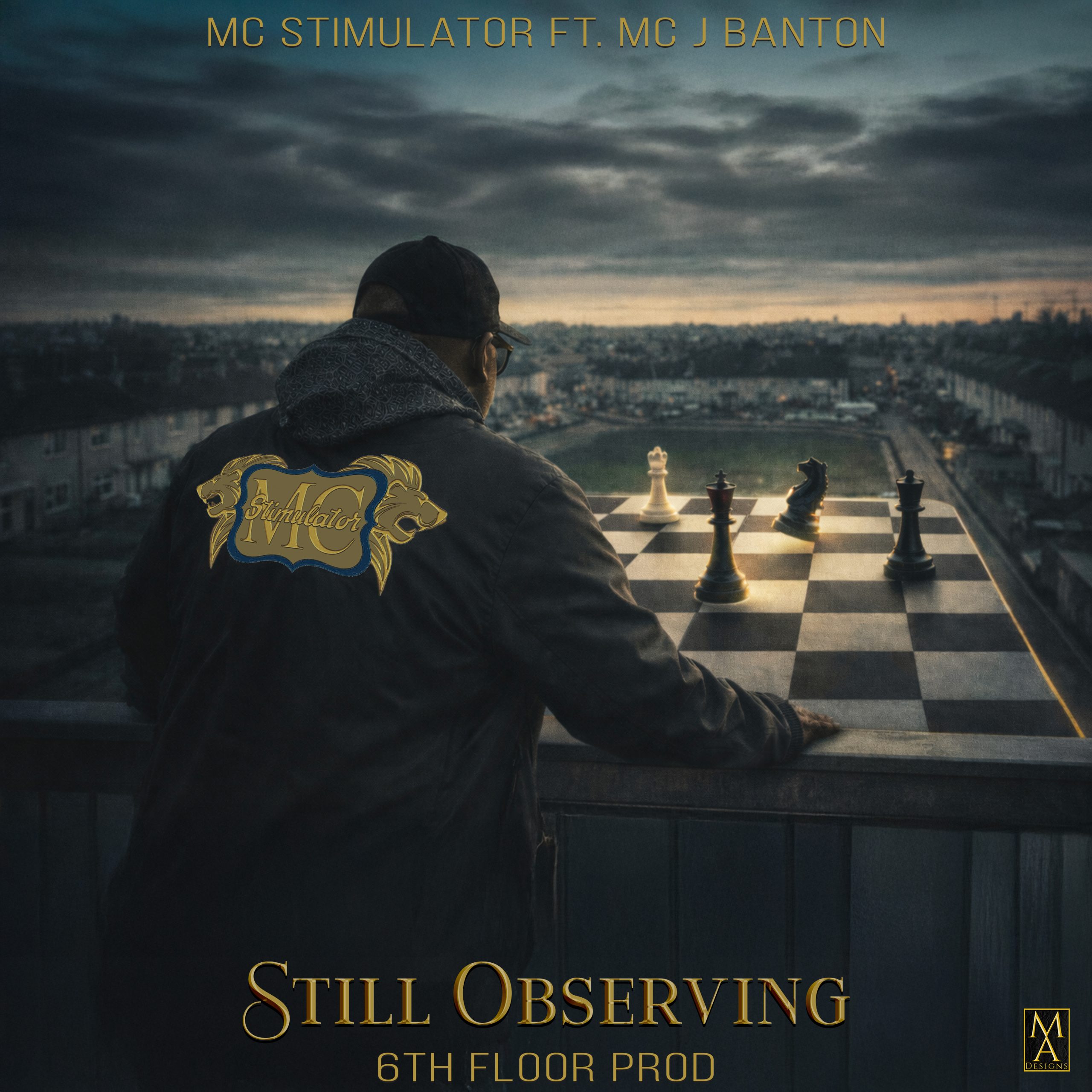
A restrained cinematic concept using chess, a city landscape and the artist viewed from behind to communicate strategy, tension and observation.
Different Barsman
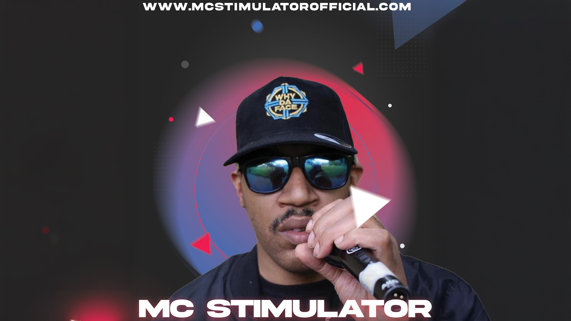
A brighter event-led direction using stage lighting, bold typography, fashion-led styling and the artist’s Why Da Face branding.
MC Stimulator × J Banton
An illustrated promotional concept using two customised cars, character artwork and a night-time city environment to announce the collaboration.
The Process
The process starts with understanding the purpose of the artwork and the story behind the music or campaign. From there, the visual direction is developed through concept, imagery, typography, composition and refinement.
The Press Kit
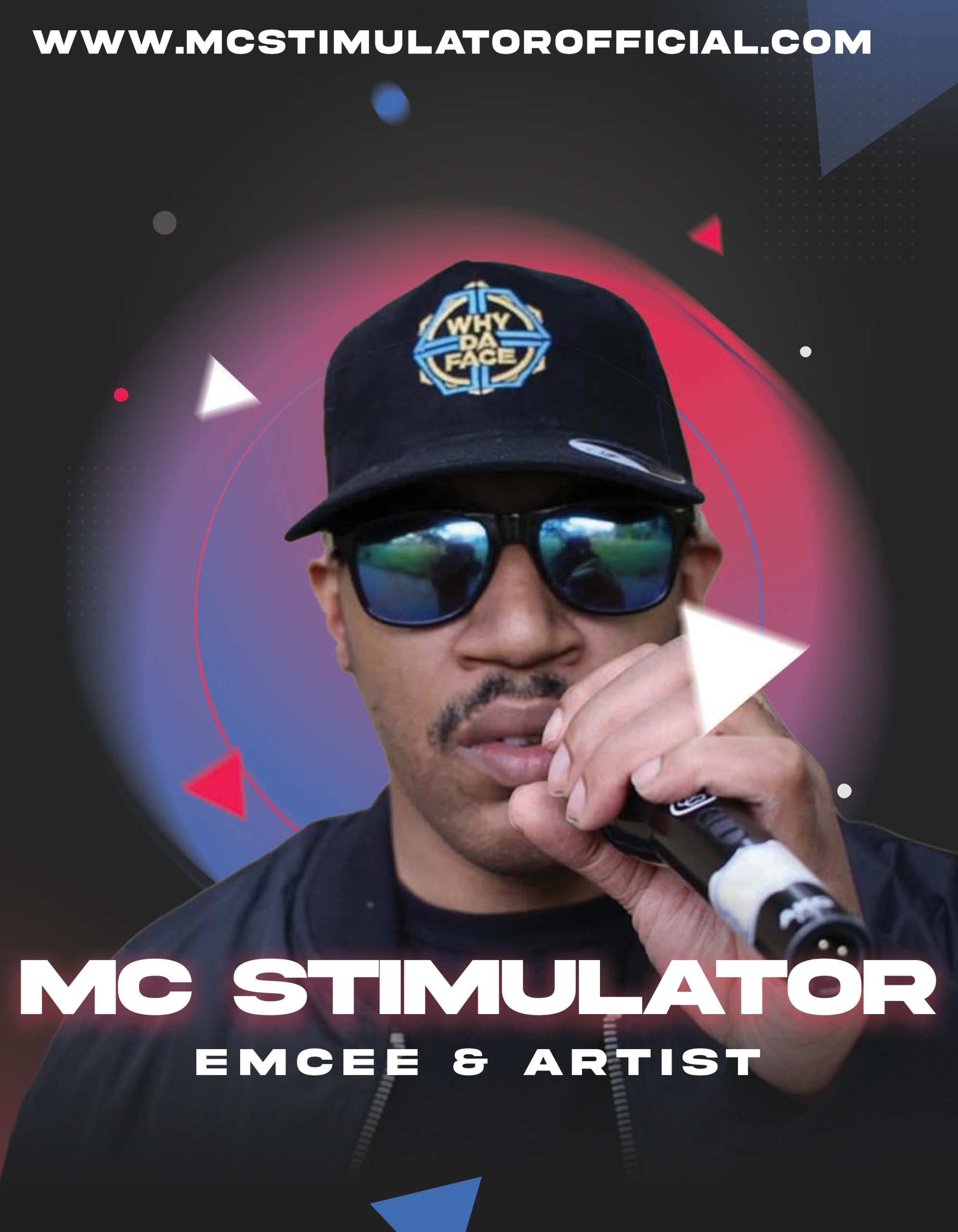
As part of the wider MC Stimulator project, M.A.Designs also created a dedicated artist press kit — bringing the artist’s story, career, music, visuals and supporting information together into one professional media resource.
The press kit includes the artist biography, career background, discography, official video information, press photography and third-party reviews, alongside links to MC Stimulator’s official platforms.
Press kit design: Editorial layout · Artist biography · Discography · Official videos · Press photos · Reviews · Digital links
As part of the wider MC Stimulator project, M.A.Designs also created a dedicated artist press kit — bringing the artist’s story, career, music, visuals and supporting information together into one professional media resource.
The press kit includes the artist biography, career background, discography, official video information, press photography and third-party reviews, alongside links to MC Stimulator’s official platforms. It was designed to give promoters, event organisers, media and industry contacts a clear, professionally presented introduction to the artist.
The Final Outcome
The result is a broad collection of visual assets spanning music artwork, release campaigns, promotional graphics and collaborative projects. The work demonstrates how one artist can move between very different visual worlds while retaining recognisable elements of the wider identity.
The wider MC Stimulator press kit also includes official video projects, discography, press photography and promotional information, giving the visual work a broader context within the artist’s professional identity.
SPAR Refresh
A university branding project exploring a new identity for a SPAR non-alcoholic beer range and a wider Refresh Festival campaign concept for Hyde Park, London.
Creating a new visual identity for a non-alcoholic beer range.
The university brief was to create a new logo and visual identity for a SPAR non-alcoholic beer range, then develop the branding into a wider campaign concept for a Refresh Festival in Hyde Park, London.
The project was developed as a complete visual communication system rather than a single logo, allowing the identity to work across product packaging, advertising, outdoor media, digital applications and event graphics.
Building a bold, energetic identity.
The development work explored a visual direction aimed at a younger, social and experience-led audience. The project development sheet identified values including community, freshness, local, quality, healthier choices and energy, alongside an audience interested in music, social experiences and active lifestyles.
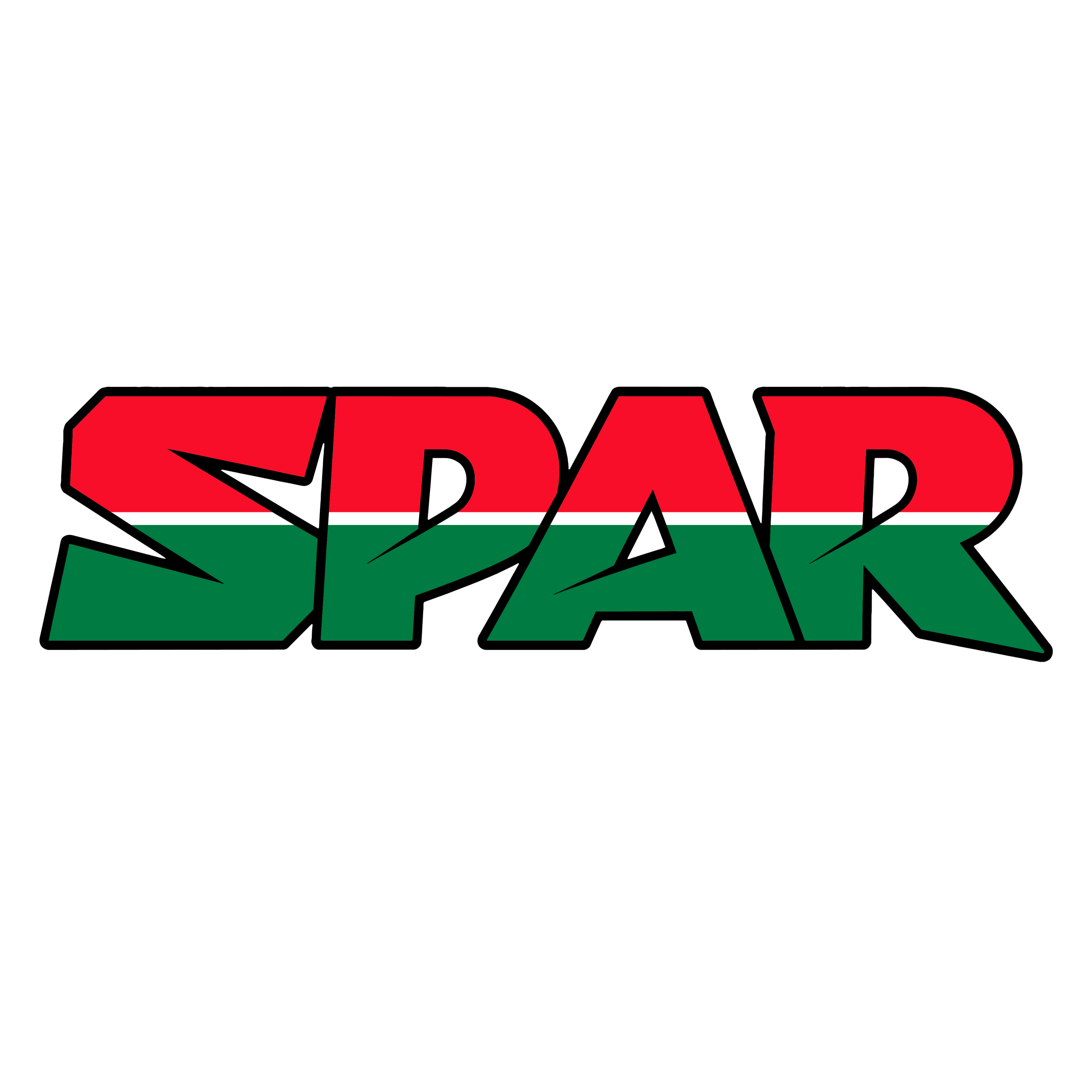
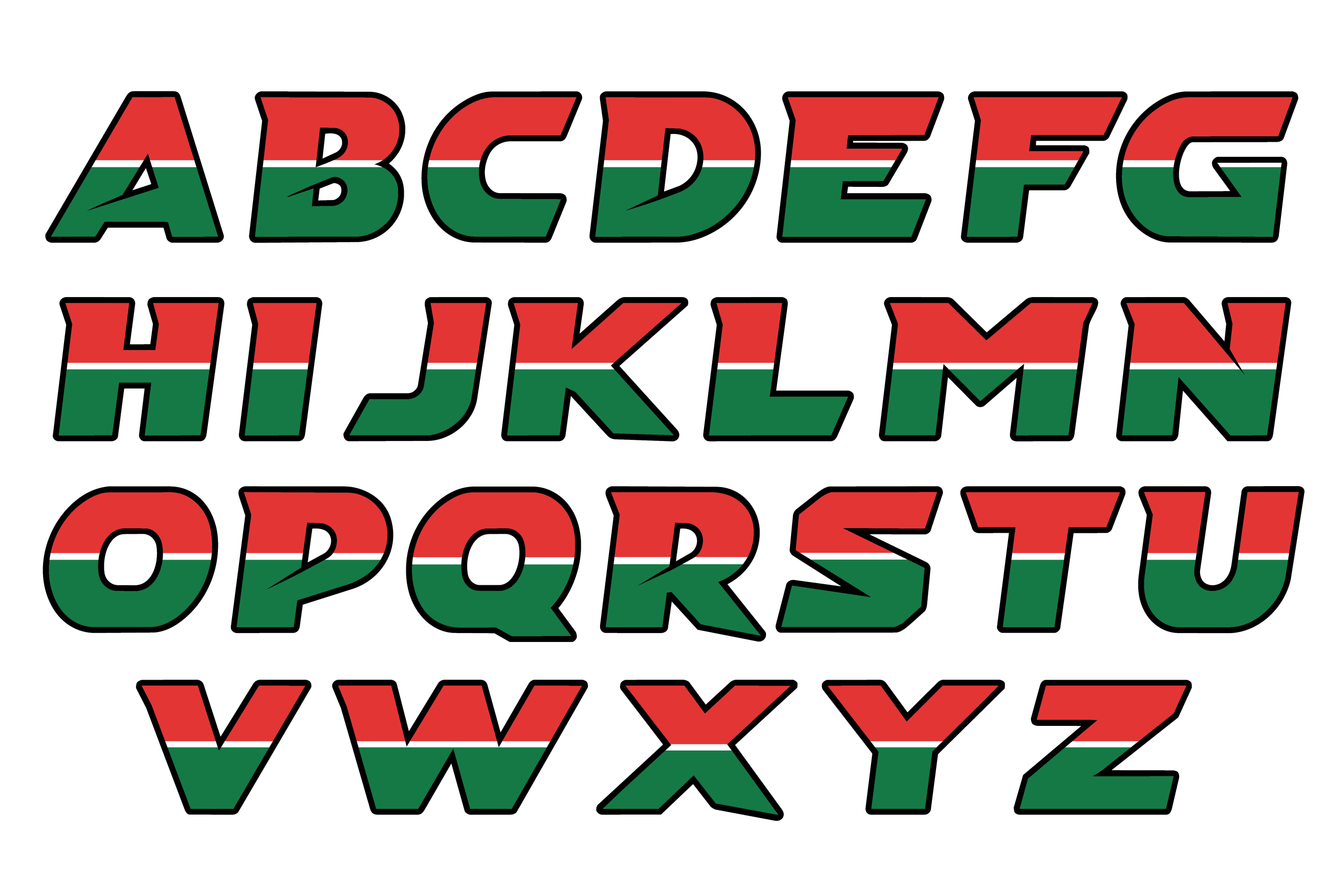
The design direction explored how a recognisable SPAR-inspired colour language could be combined with a more distinctive custom lettering system for the Refresh concept.
Designing a custom lettering system.
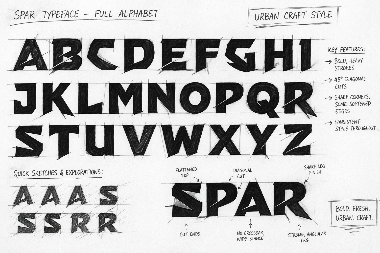
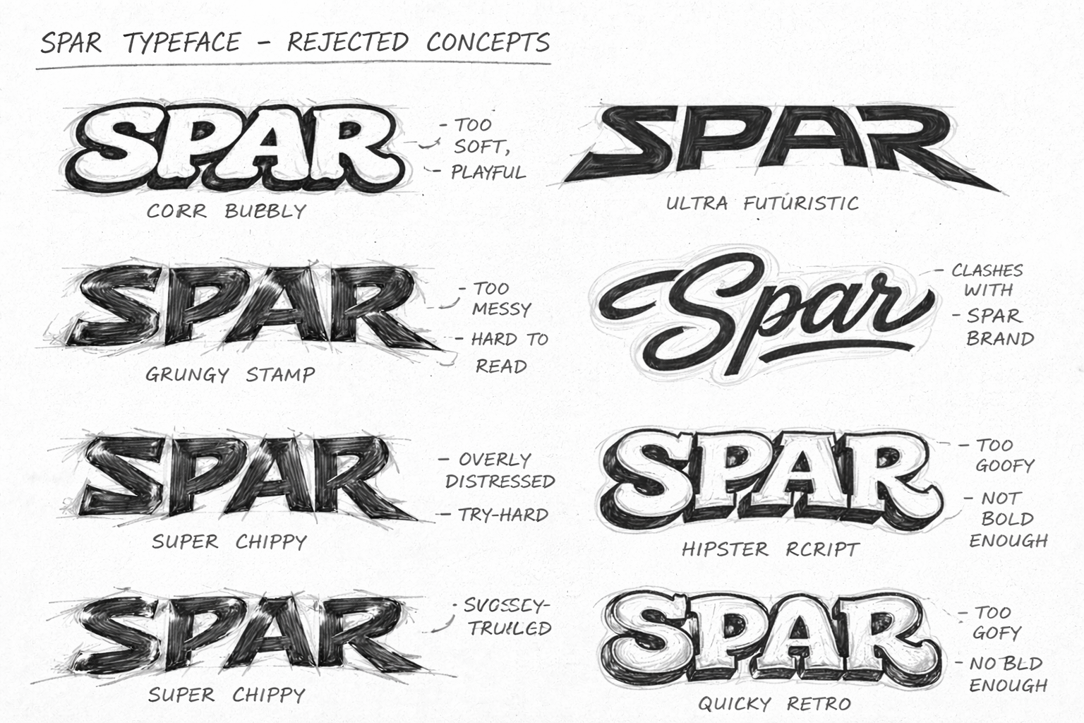
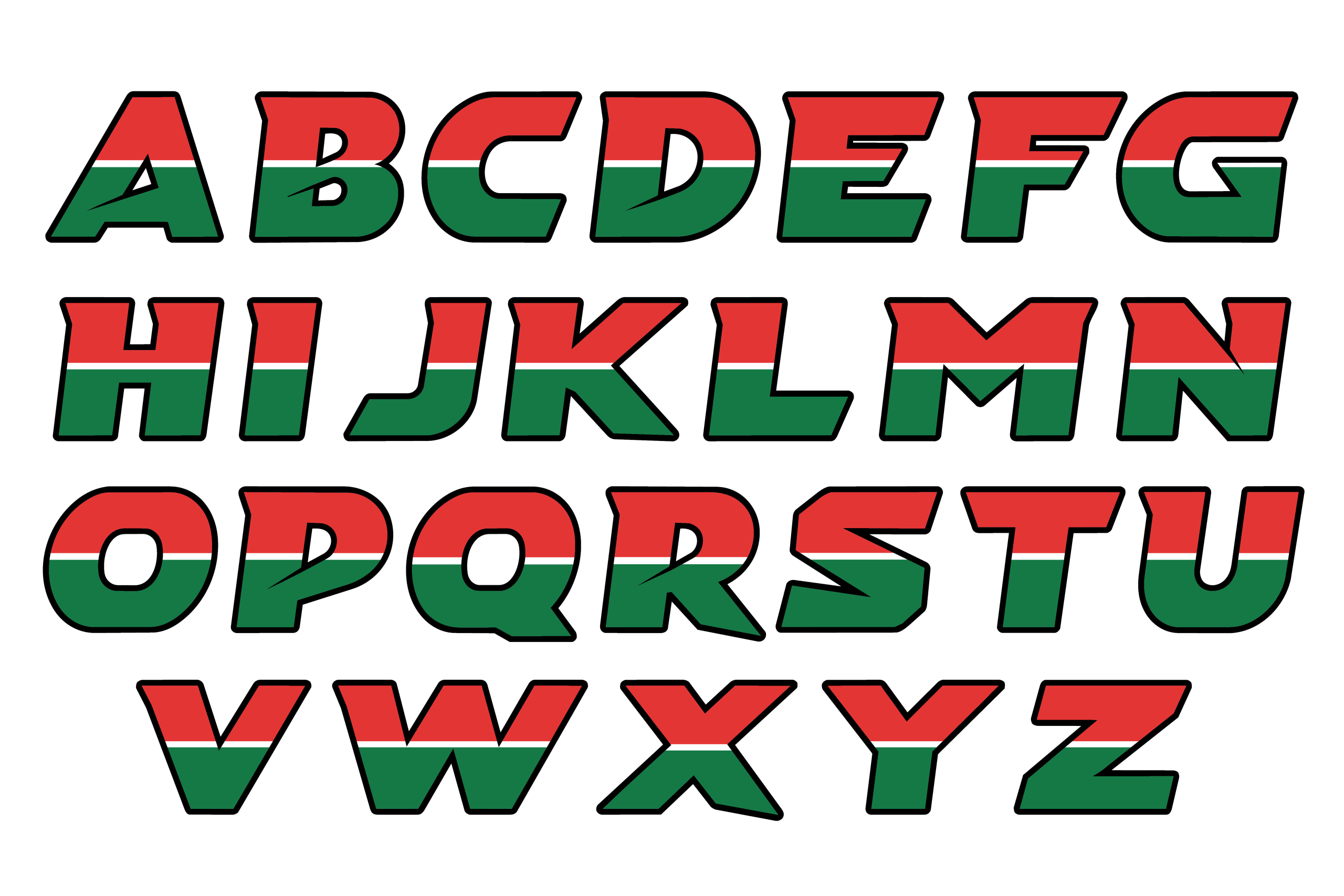
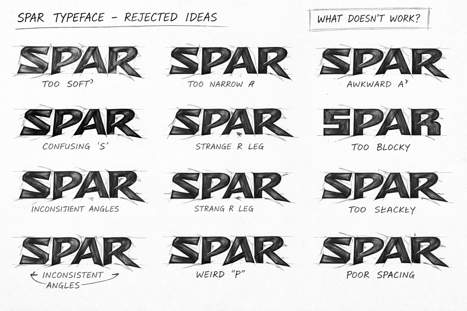
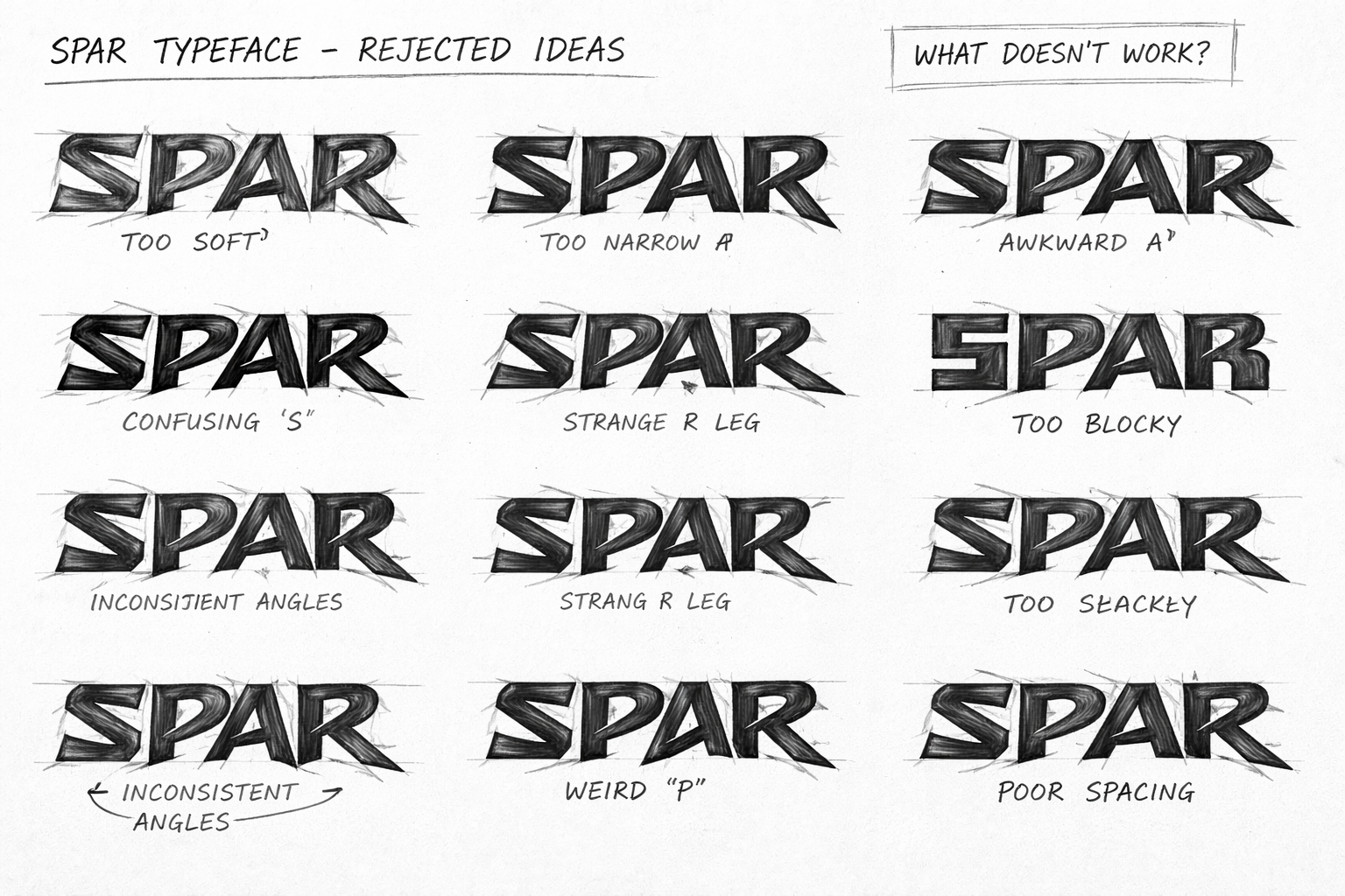
A major part of the project was developing a custom alphabet and wordmark rather than relying on standard typography. The process moved through multiple sketches, alphabet studies and rejected directions before reaching a more confident final lettering style.
The rejected concepts document the reasoning behind the development: some directions were considered too soft or playful, others too messy, overly futuristic, difficult to read or inconsistent in their letterforms. Reviewing these alternatives helped narrow the visual language towards a stronger, more angular and energetic direction.
Extending the identity onto packaging.
The final concept was applied to a five-flavour non-alcoholic beer range: Original, Lime & Mint, Berry, Mango and Peach. The can artwork uses the developed lettering and colour system to create a family of products while allowing each flavour to have its own visual distinction.
Taking the identity from product to experience.
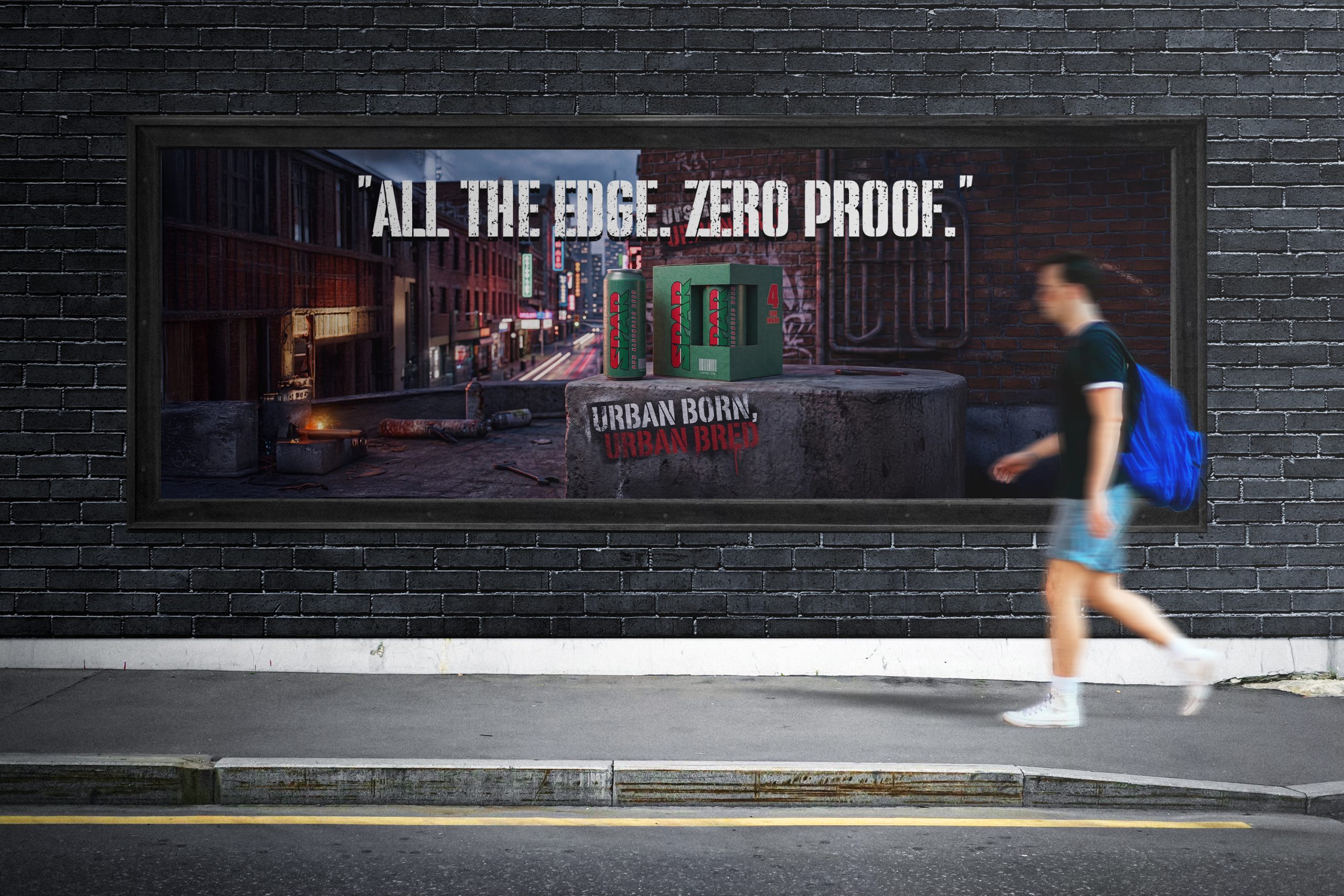
The next stage of the project developed the Refresh identity into a festival campaign concept for Hyde Park, London. The artwork explored an event environment built around music, food, community, product sampling, competitions and zero-alcohol experiences.
The campaign system was designed to translate the same visual language across posters, outdoor advertising and digital communications, creating a consistent connection between the product range and the festival concept.
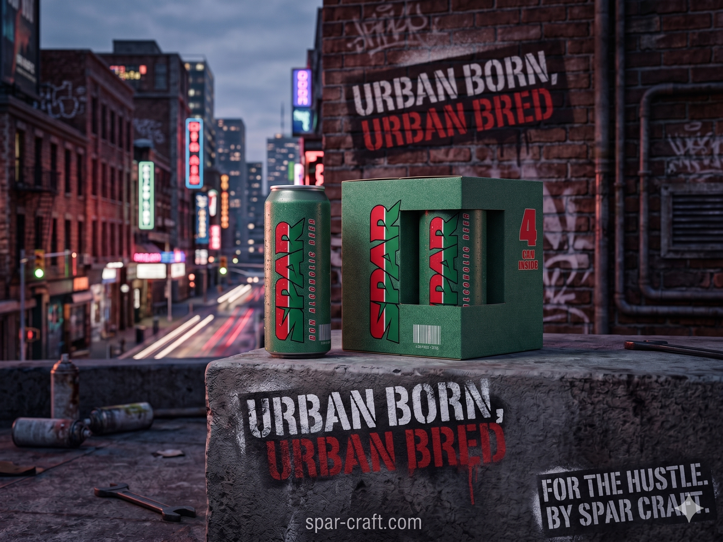
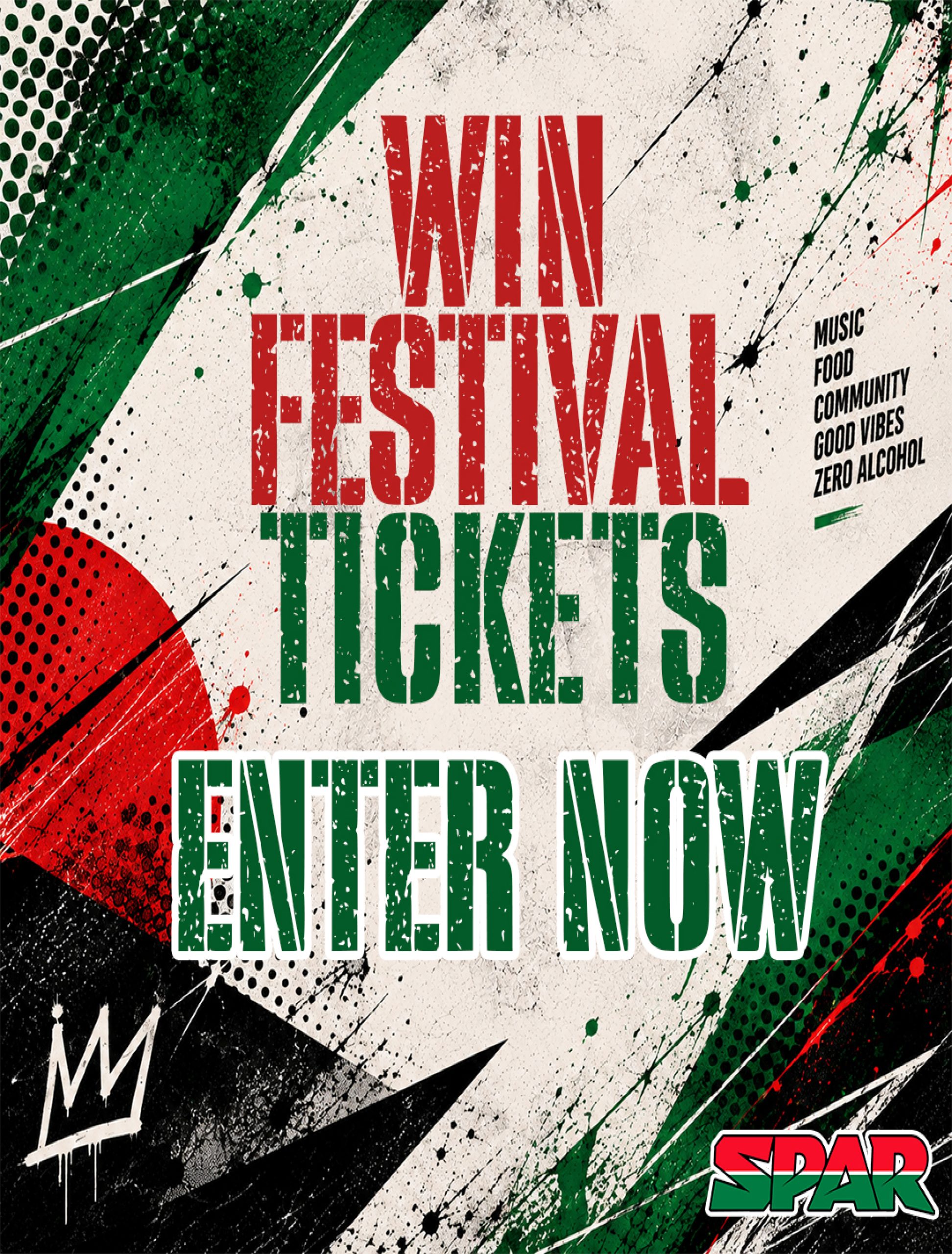
A complete visual communication system.
The concept was developed to work across multiple touchpoints, including product packaging, festival posters, outdoor advertising, billboards, street-level placements and digital campaign material. The aim was to keep the identity recognisable while adapting the composition and information hierarchy to each format.
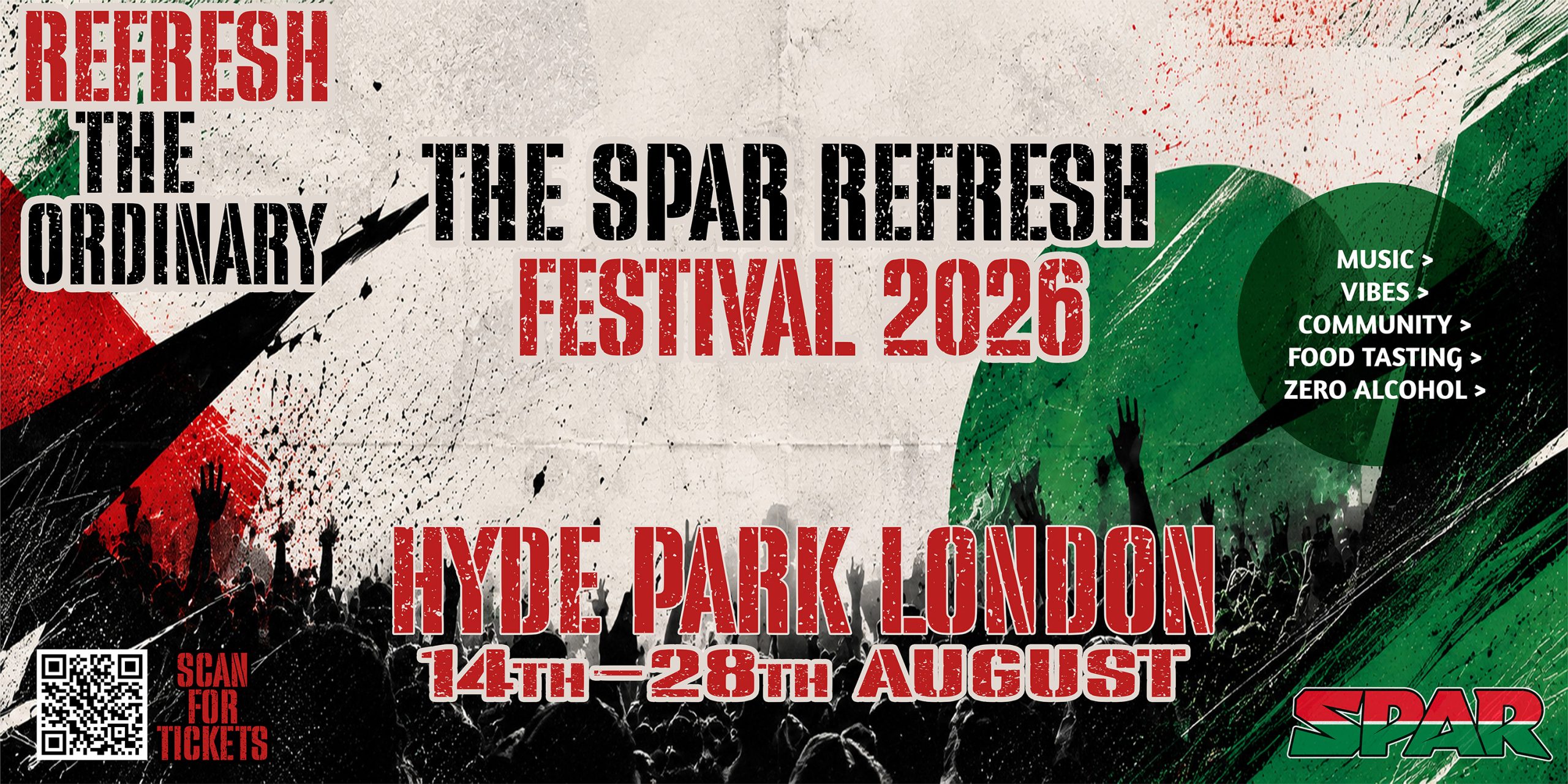
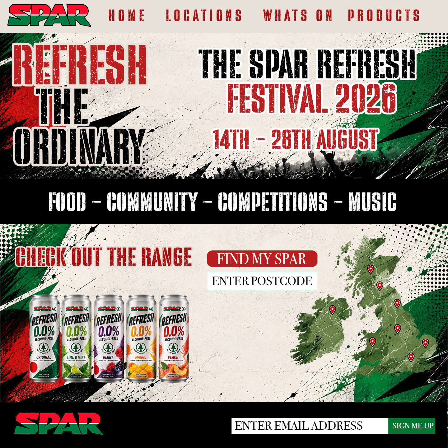
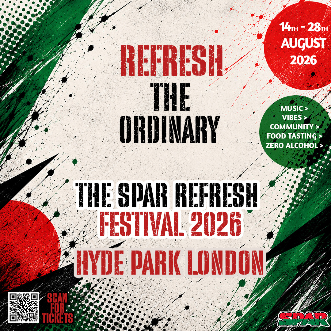
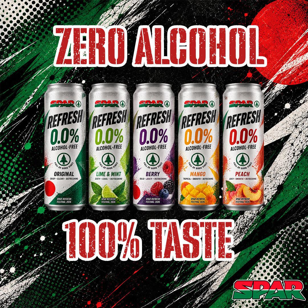
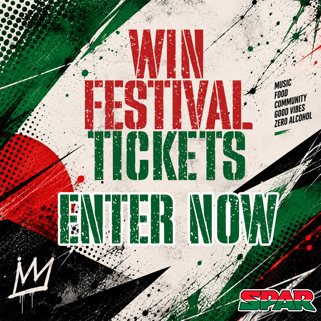
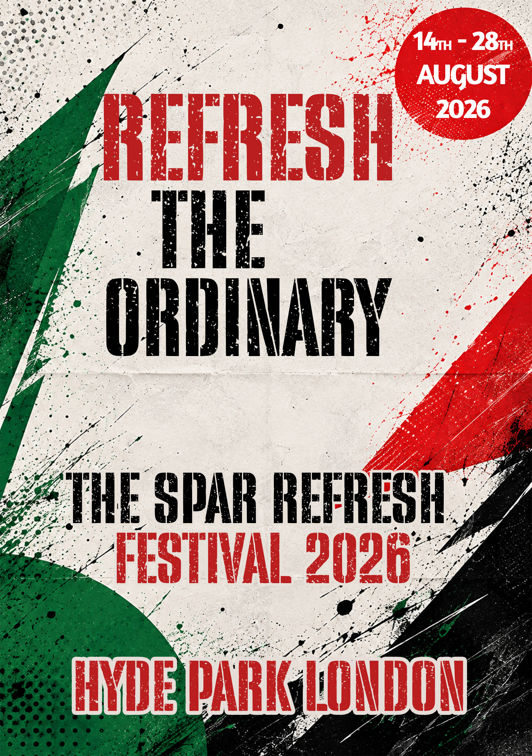
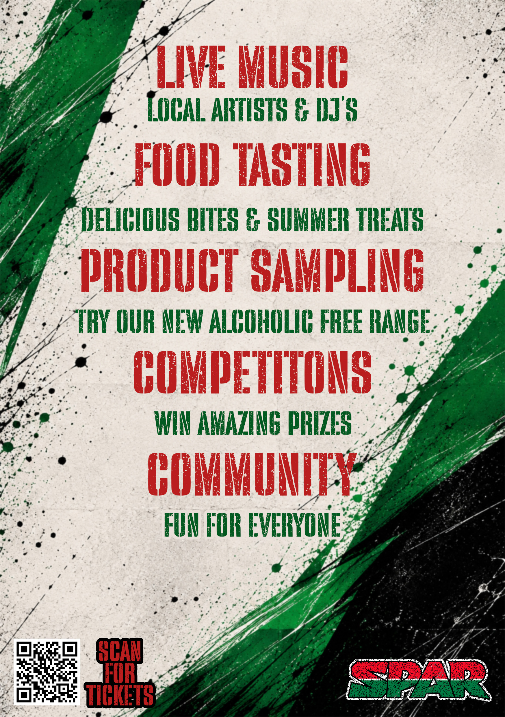
From a logo brief to a complete graphic design portfolio case study.
The project allowed me to explore how a single identity can develop into a wider visual system. The strongest part of the process was the progression from experimental lettering and rejected concepts through to a finished alphabet, product range and campaign direction.
It also gave me the opportunity to consider how the same brand language behaves at different scales — from a can and wordmark through to large-format outdoor advertising and an event environment.
SPAR Refresh
A university concept combining brand identity, custom typography, packaging, campaign art direction and event branding into one connected visual system.
C.O.B.R.A. Self Defence Systems & NexGen Protection
A long-term design collaboration creating branding, promotional campaigns, educational materials, apparel and programme identities across child protection, women’s protection, fitness and personal safety.
Design supporting real-world protection programmes.
Over a number of years, I worked alongside C.O.B.R.A. Self Defence Systems and NexGen Protection, producing visual communication for a range of programmes and initiatives.
The work covered much more than individual graphics. I helped develop and apply visual identities across promotional posters, programme branding, educational materials, certificates and instructor clothing, adapting the design language to different audiences while keeping the organisations recognisable.
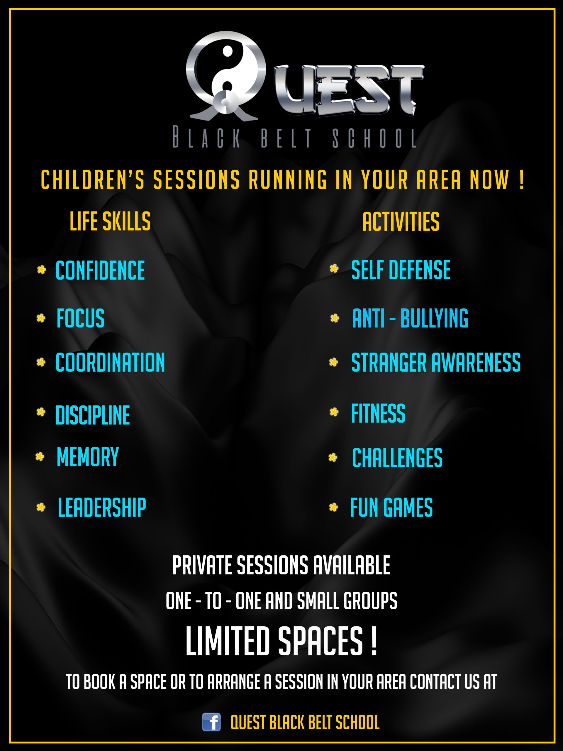
Creating clear visual communication for child safety.
A major part of the collaboration involved child protection and prevention initiatives. I created branding and promotional material for programmes including C.A.P. — Child Abduction Prevention and youth-focused safety campaigns.
The designs were developed to communicate serious information quickly and clearly, using strong typography, high-contrast colour and recognisable programme branding.
Campaign design for women’s personal safety.
I also worked on promotional material for women’s protection and self-defence initiatives, creating visual campaigns designed to communicate the purpose of the sessions and encourage participation.
The work included dedicated promotional artwork and campaign messaging, extending the wider C.O.B.R.A. identity into a more specific audience-focused communication style.
Developing an anti-knife education programme.
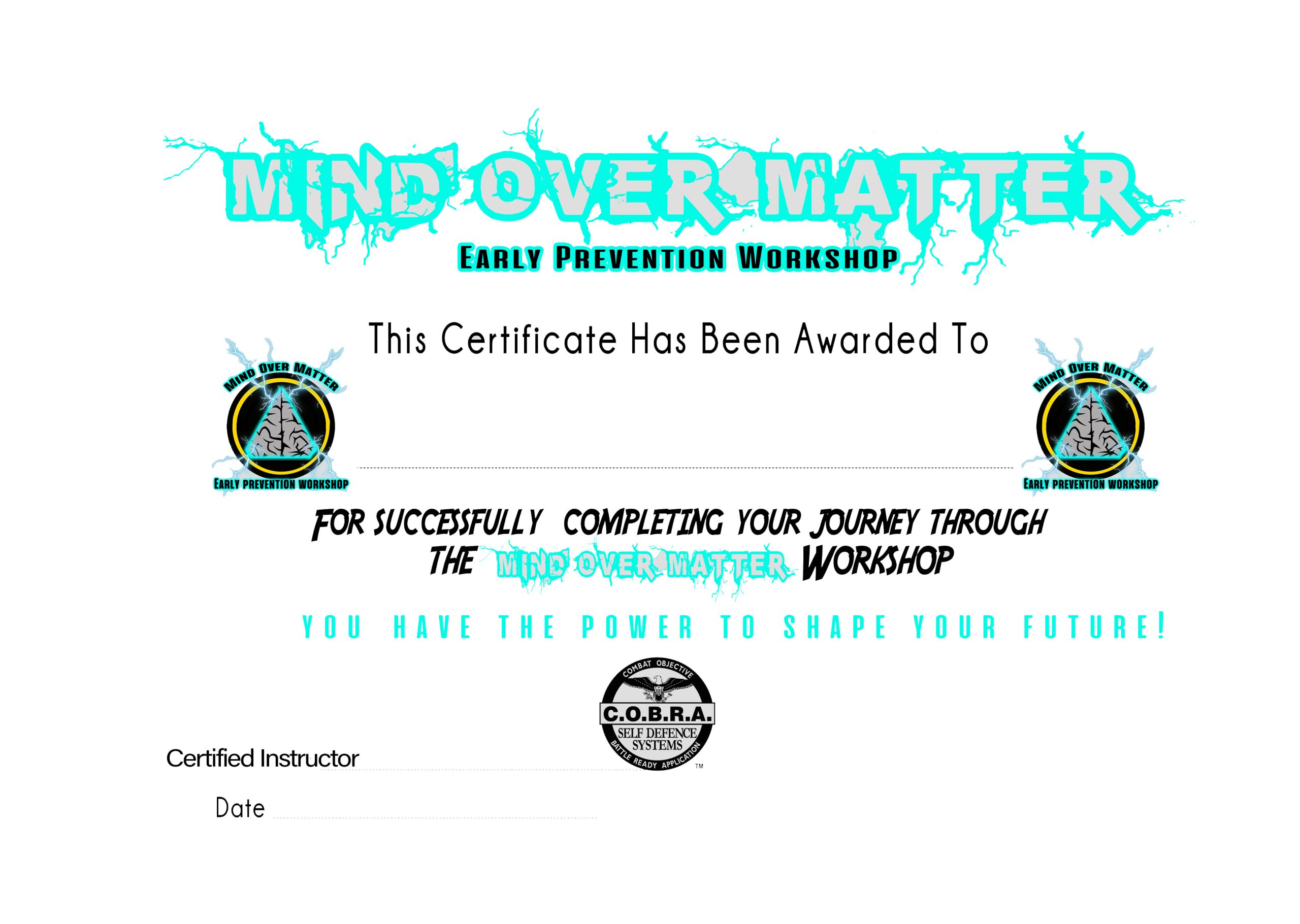
One of the most significant projects was working alongside the organisation to develop the visual communication for Mind Over Matter, an anti-knife and early-prevention programme designed to be taught in schools.
The branding needed to feel relevant to young people while still communicating an important educational message. I created supporting visual material including programme graphics and certificates used to reinforce the identity of the workshops.
Extending the identity across different audiences.
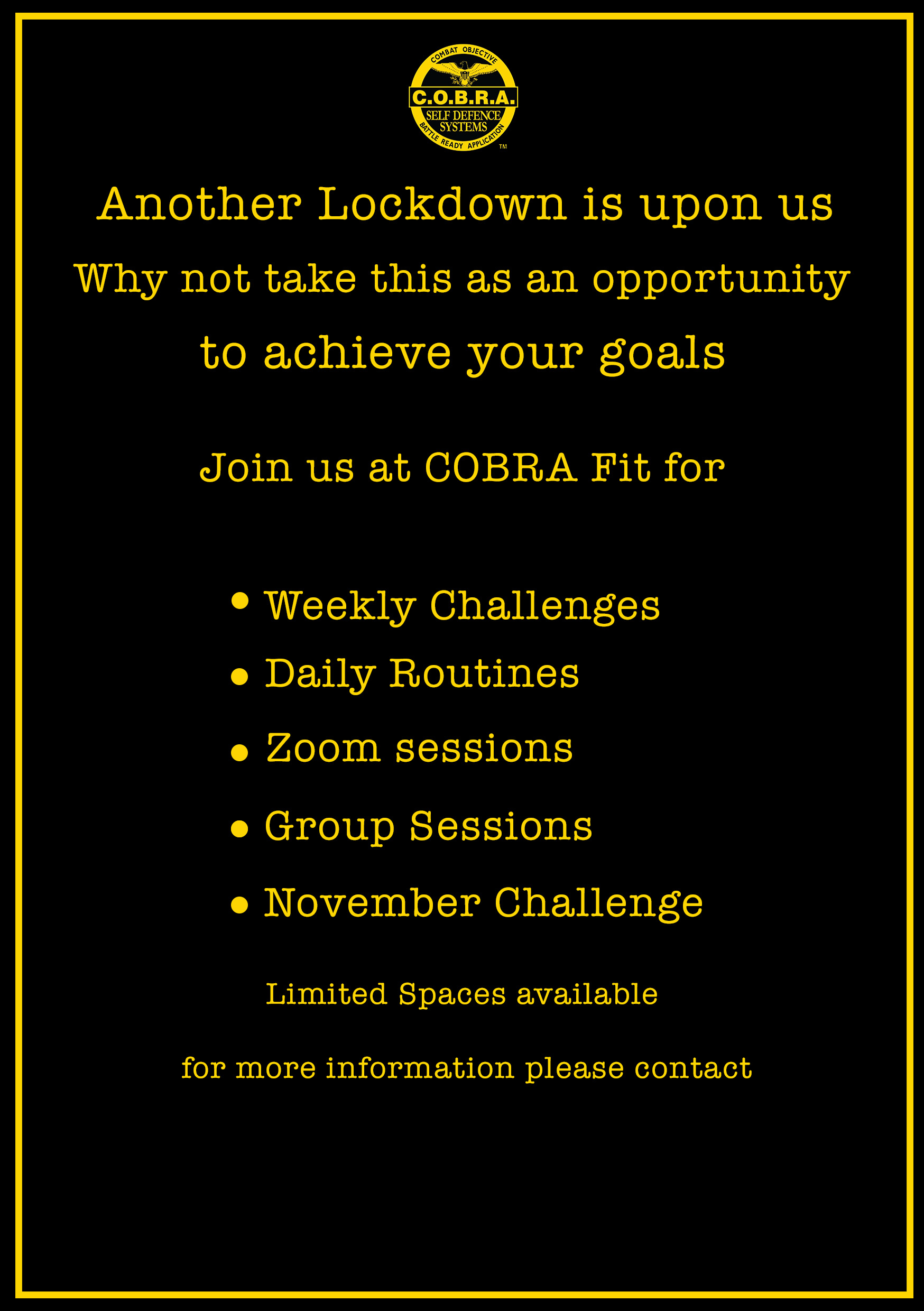
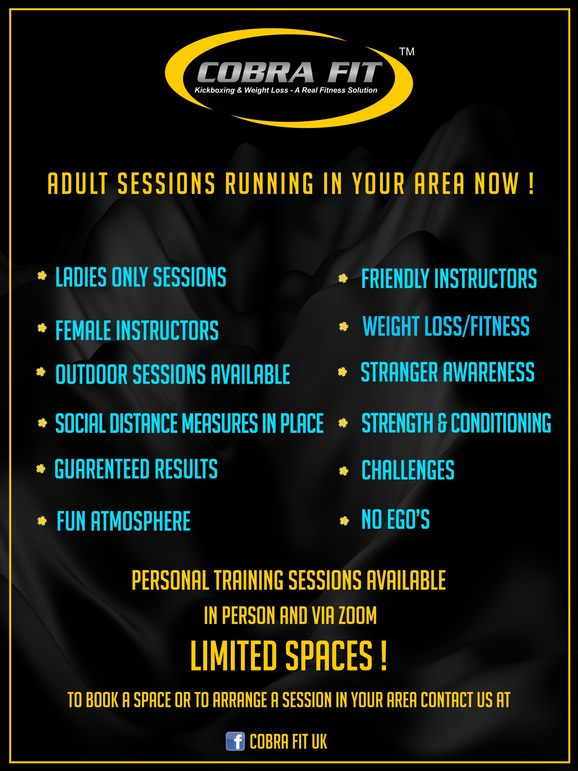
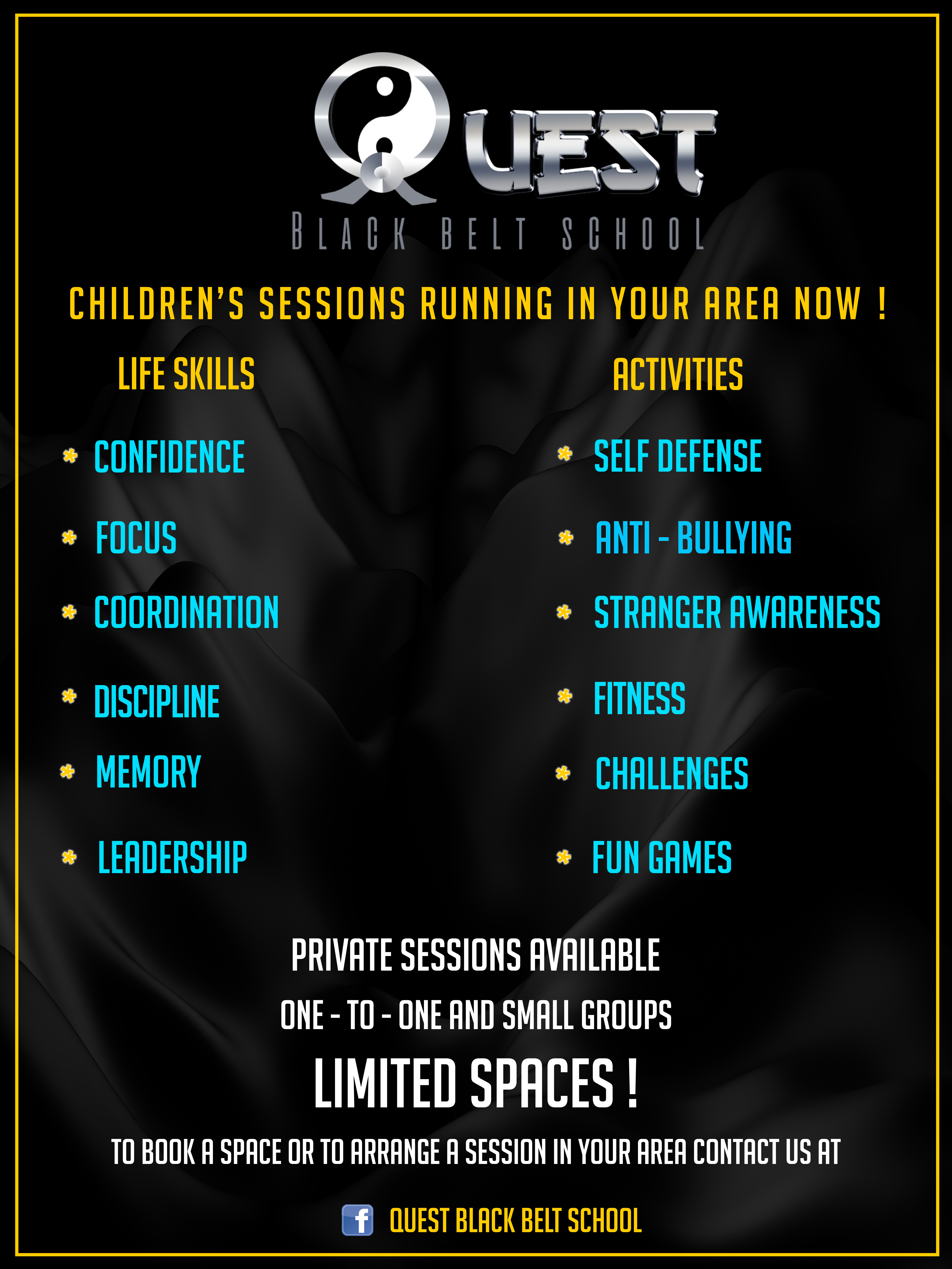
The collaboration also included fitness and martial-arts related programmes such as Cobra Fit and Quest Black Belt School. These projects required different visual treatments while remaining connected to the wider protection and training environment.
Turning the identity into a wearable system.
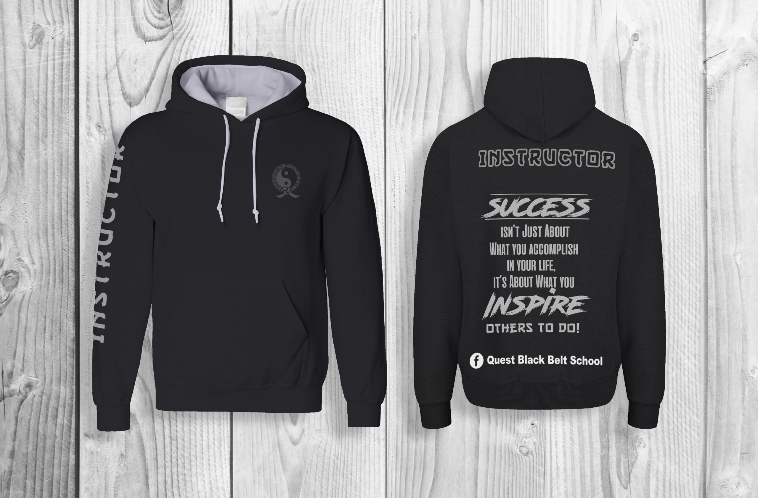
I designed branded instructor clothing to create a consistent professional appearance across training environments. The work included T-shirts and hoodies, applying programme logos, messaging and identity elements to practical uniform pieces.
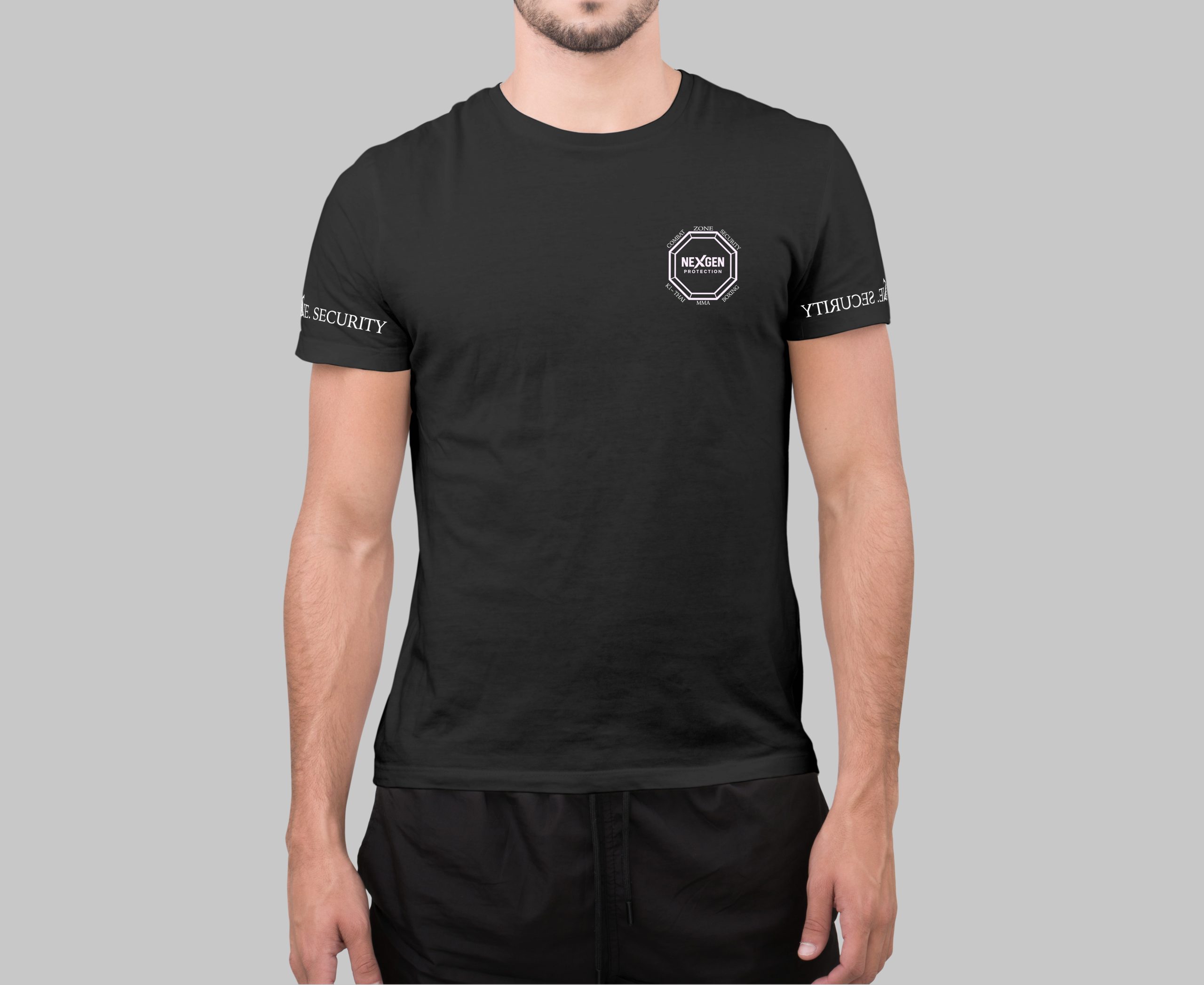
One collaboration, many visual applications.
A long-term design partnership.
This collaboration gave me the opportunity to work on design that needed to function in real environments — from posters and school programmes to certificates, clothing and promotional campaigns.
It also demonstrates the breadth of my design practice: taking an organisation’s existing identity and translating it into clear, practical and audience-specific visual communication across multiple formats.
C.O.B.R.A. × NexGen Protection
Branding · Child Protection · Women’s Protection · Anti-Knife Education · Fitness · Apparel · Posters · Certificates · Campaign Design