University project · Poster design and animation
For my Power of Play project, I could choose between LEGO posters and posters using playful typography. I chose LEGO because I wanted to show that growing up doesn’t mean giving up play. As adults, it’s easy to get caught up in work, bills and the rat race. Playing a game, doing a sport or playing with our children can give us time to let loose and use our imagination.
From LEGO to landmarks
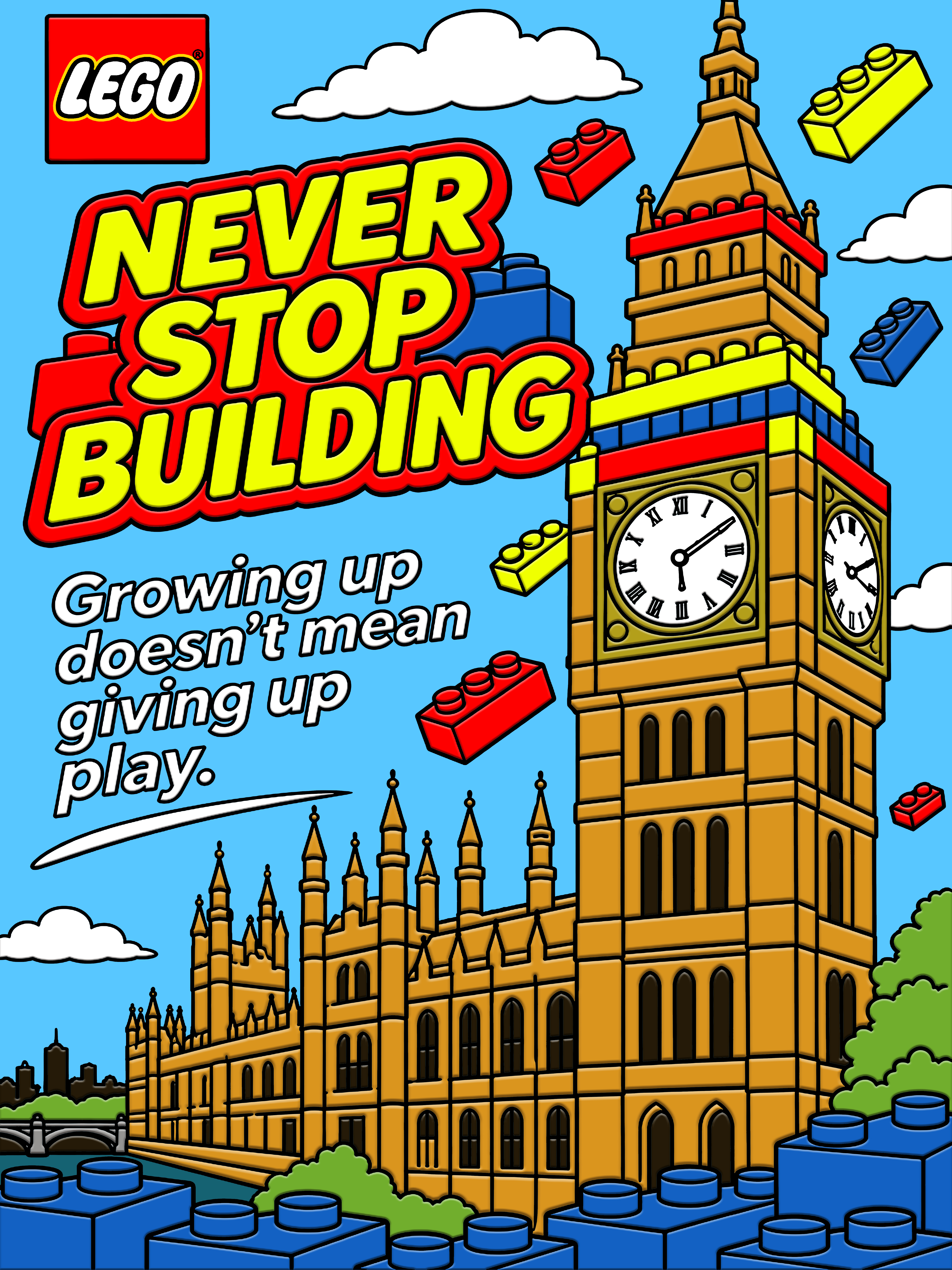
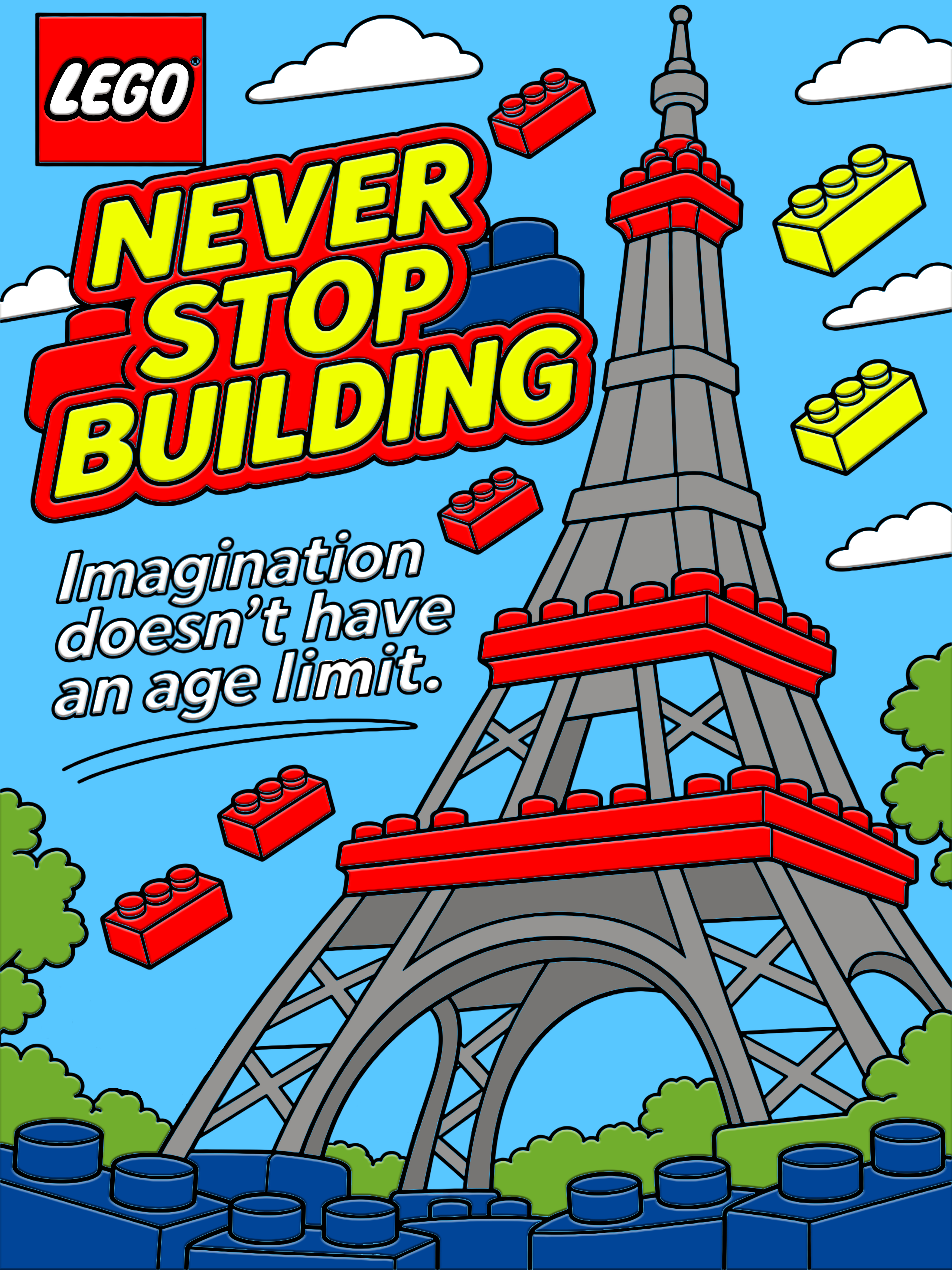
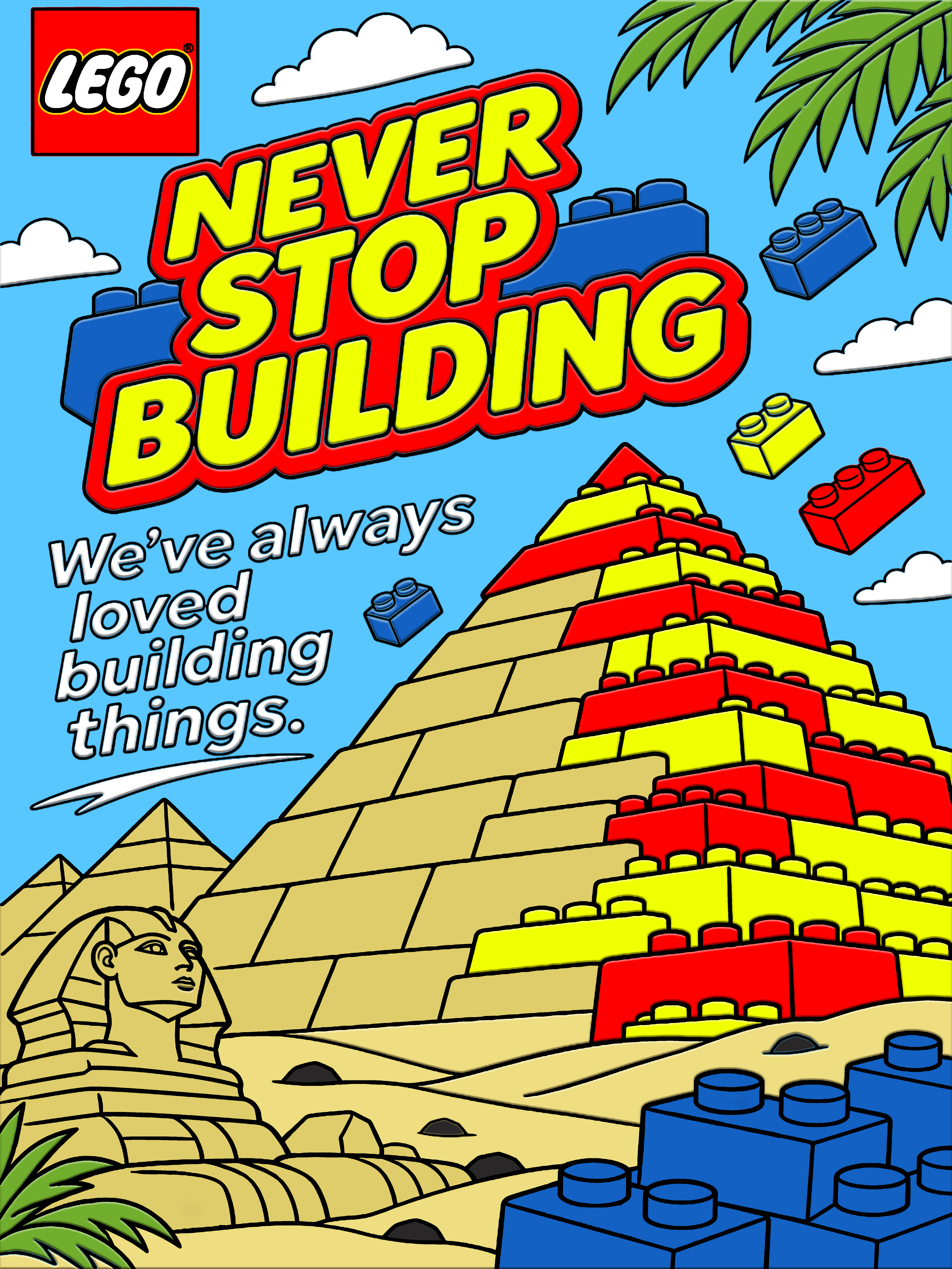
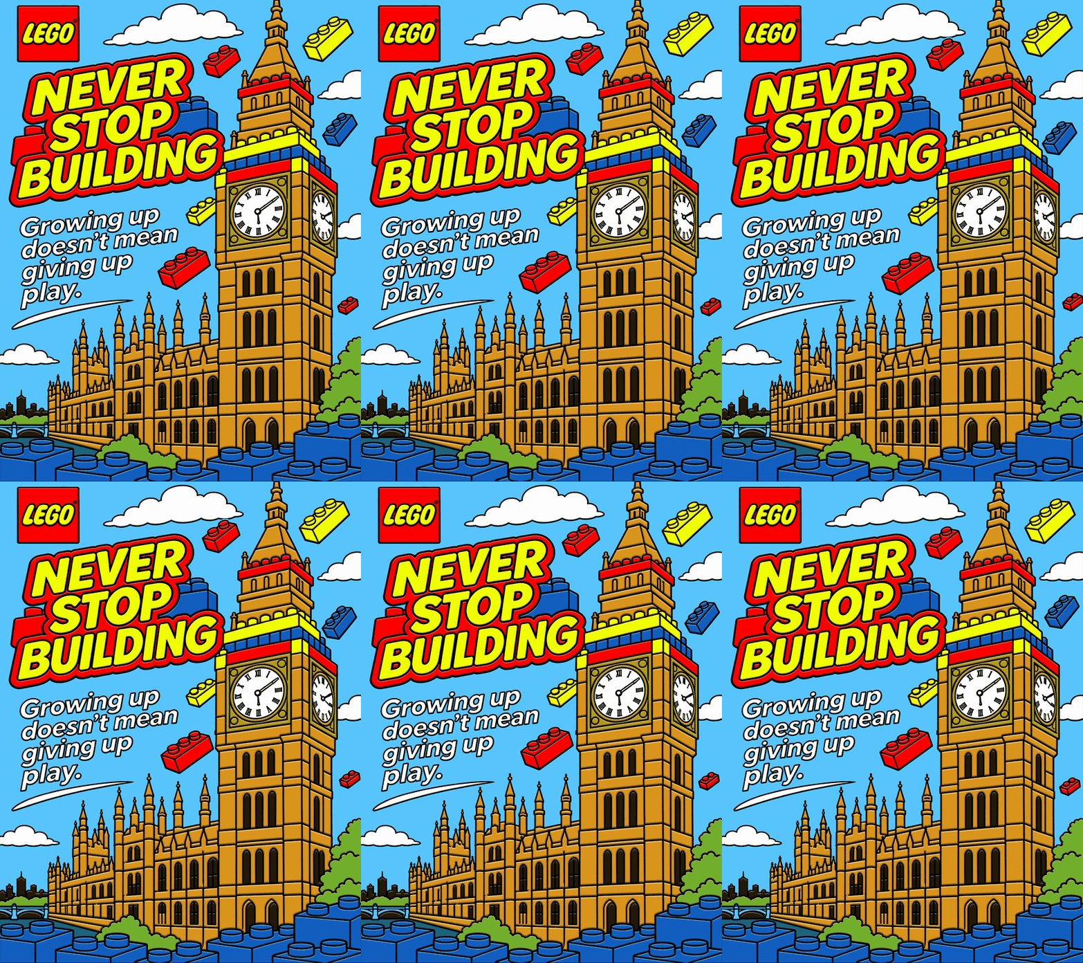
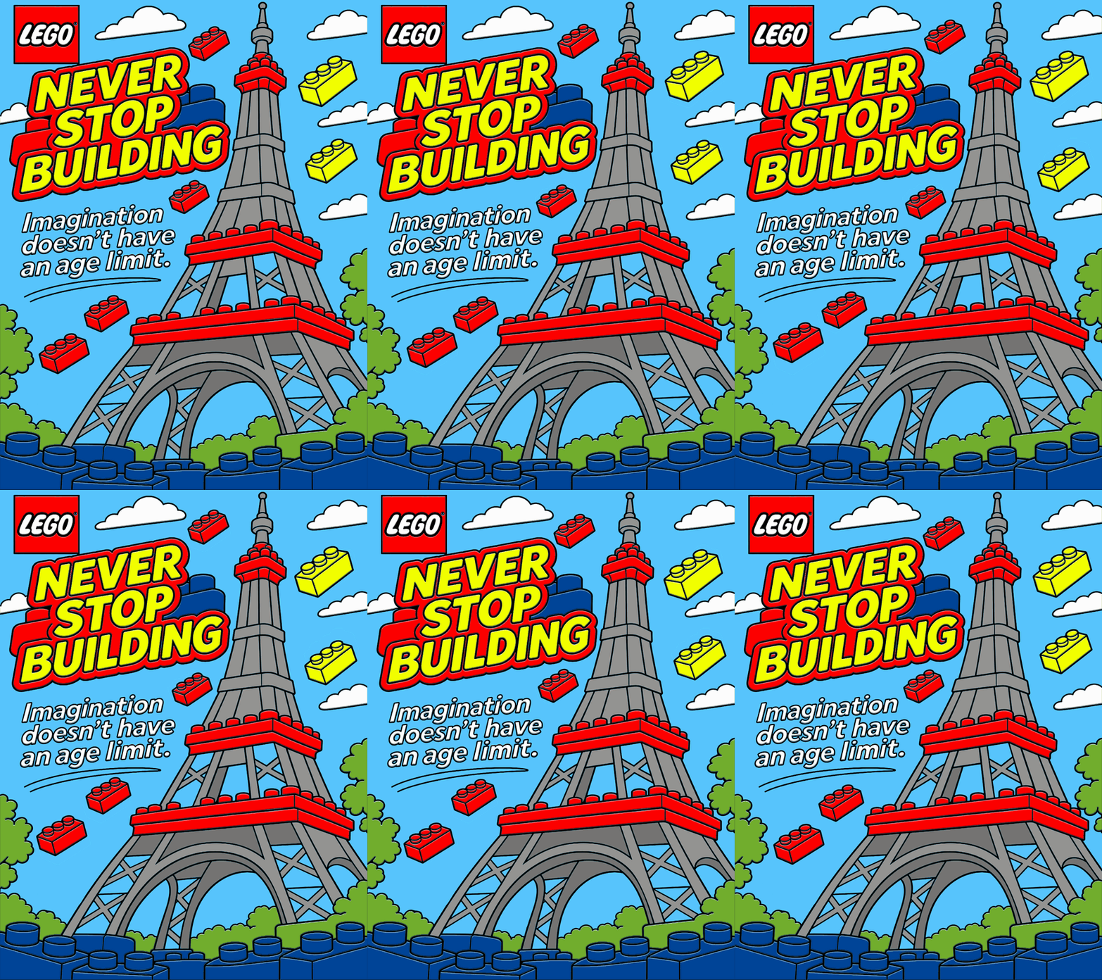
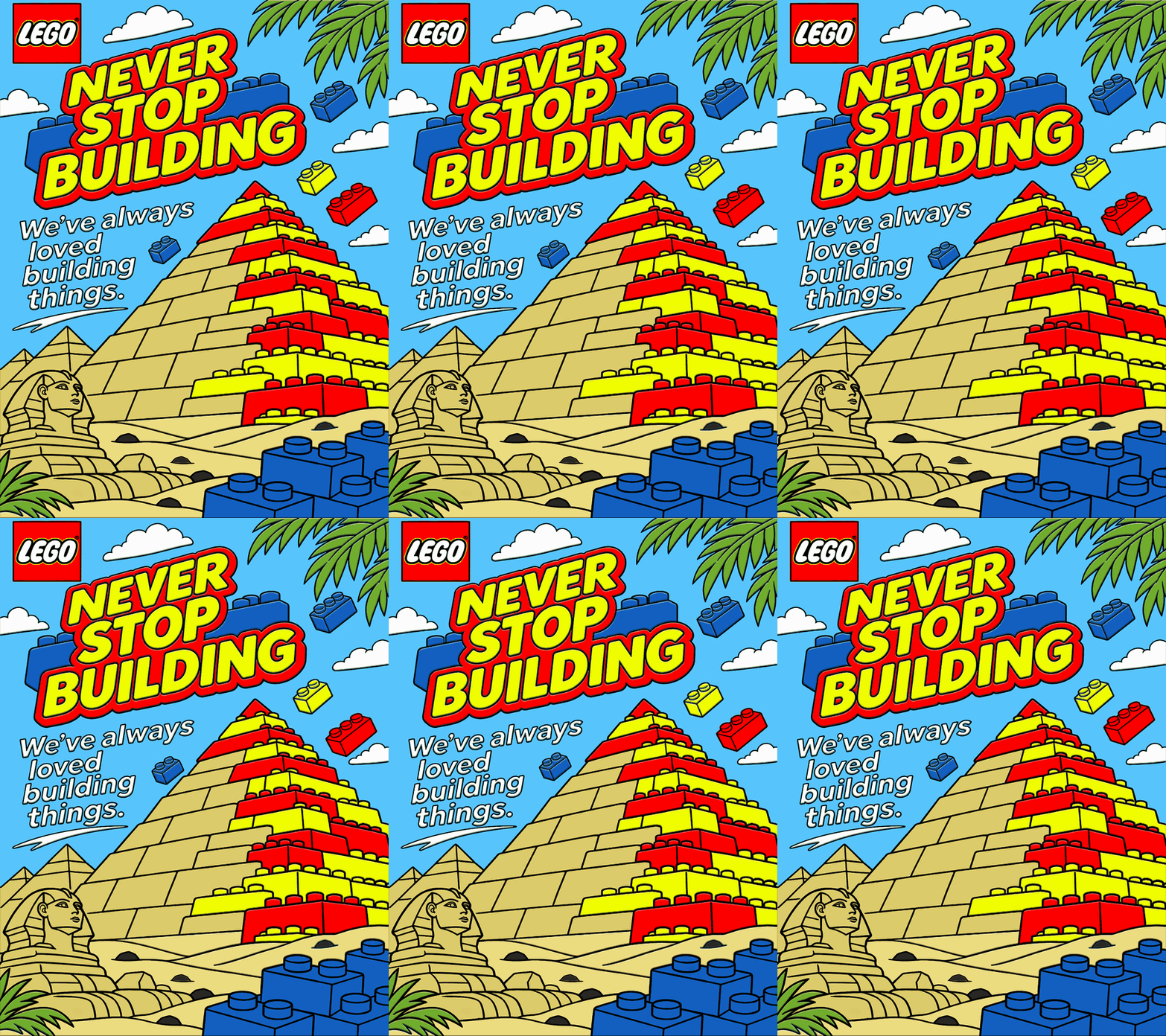
I chose Big Ben, the Eiffel Tower and the pyramids. The pyramids are a personal favourite because I’d just come back from Egypt and seen them for myself. I made each landmark half LEGO and half real structure. We build with LEGO bricks as children and with real bricks as adults. To me, building and designing is grown-up play.
Sketches and poster outlines
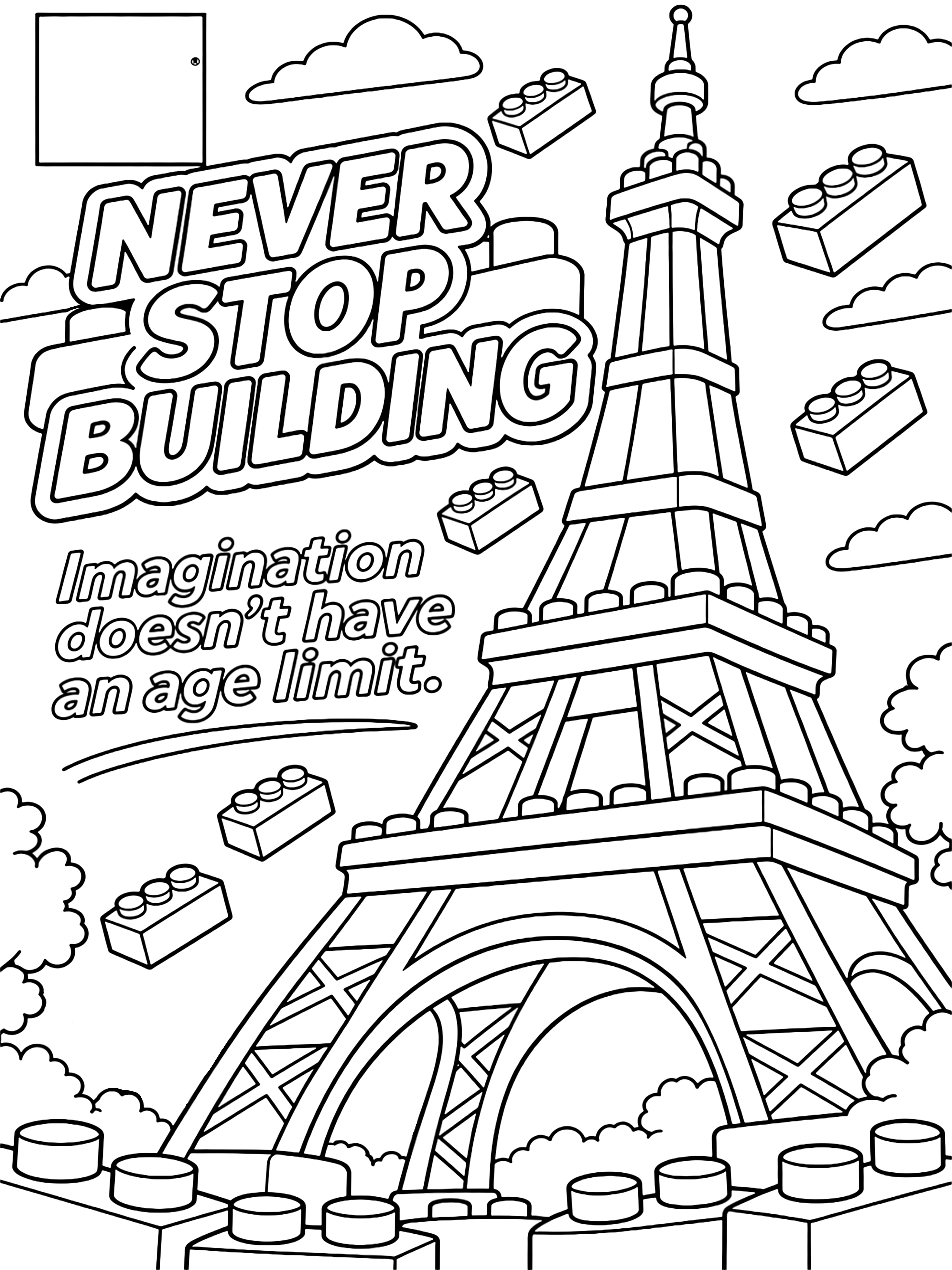
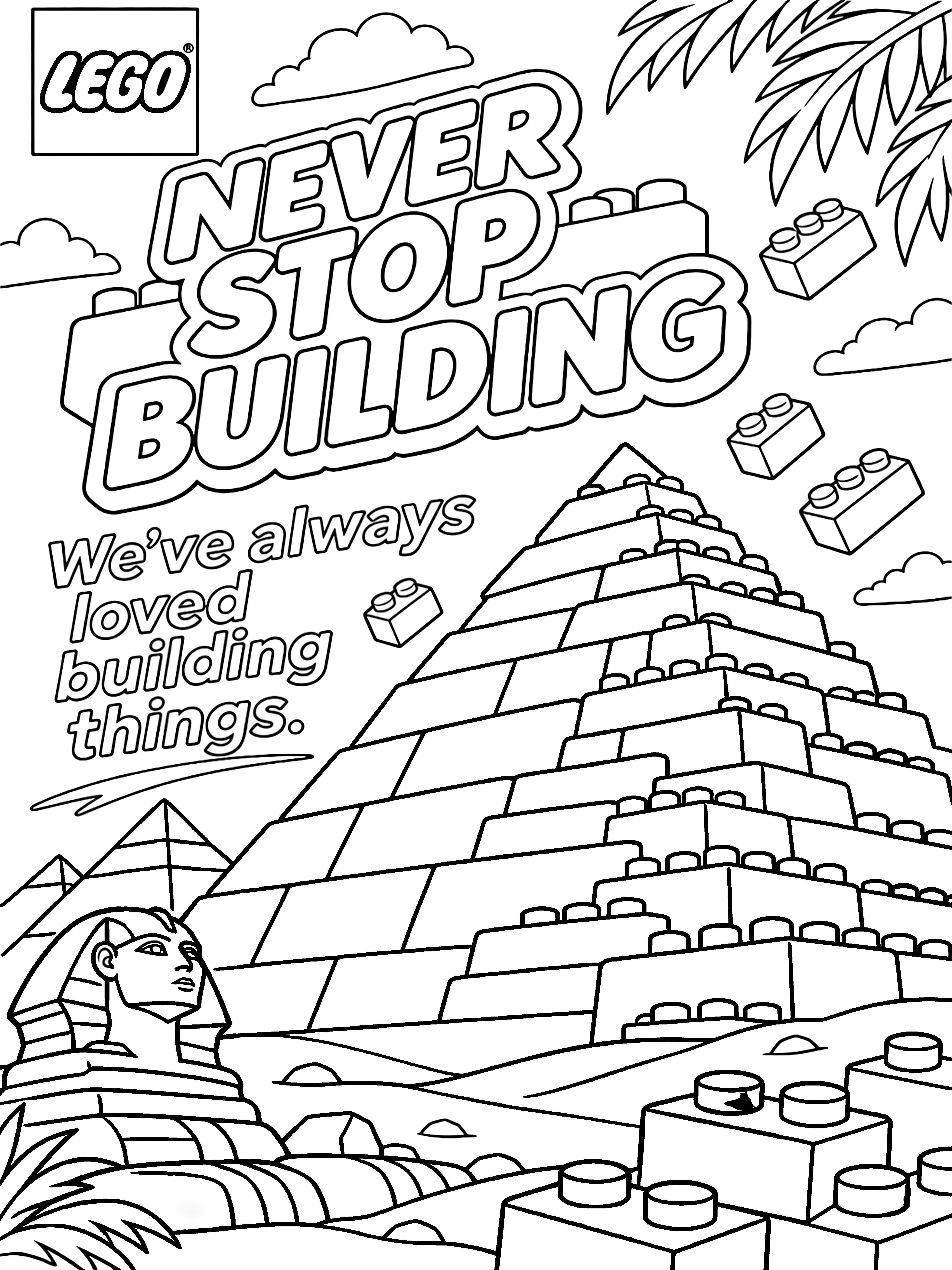
I sketched different layouts and tried including little LEGO people as the builders. I decided to leave them out and drew the outlines on my iPad in Procreate. I took the outlines into Photoshop to add colour and used Bevel and Emboss to give the designs a polished 3D look.
Sketch boards
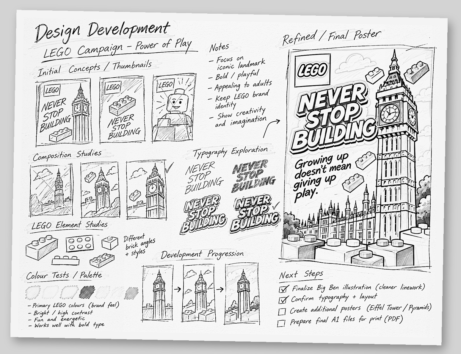
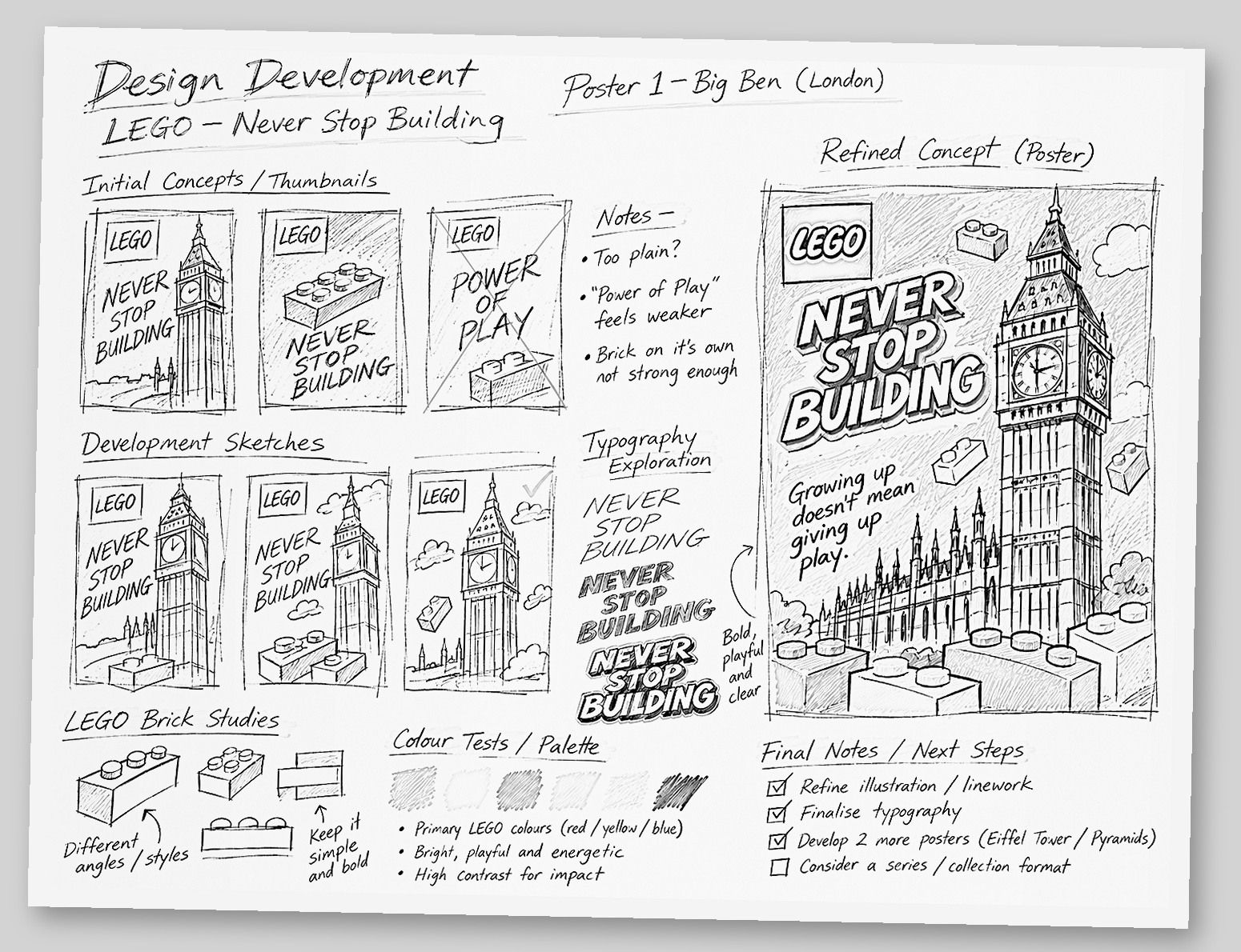
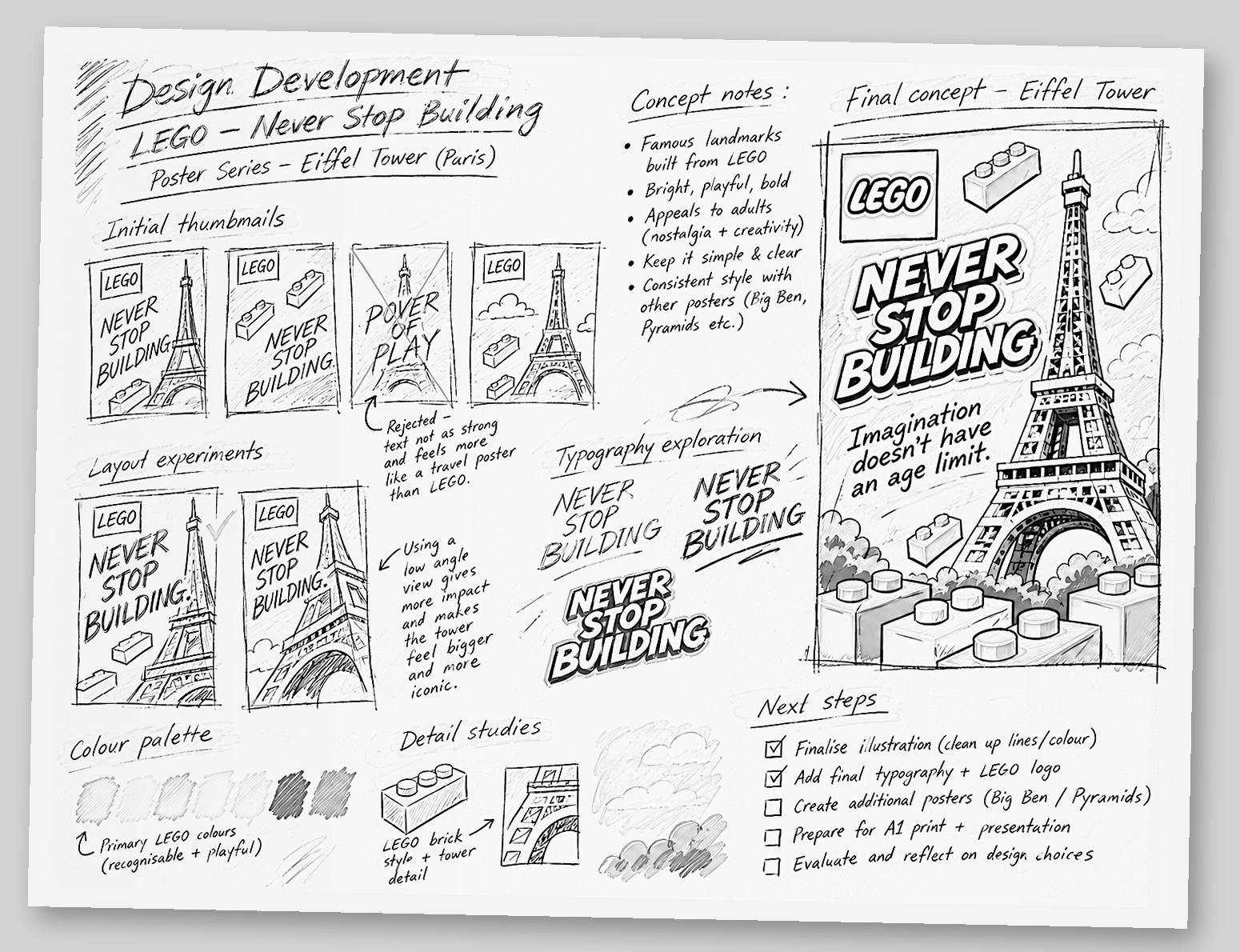
Black-and-white outlines
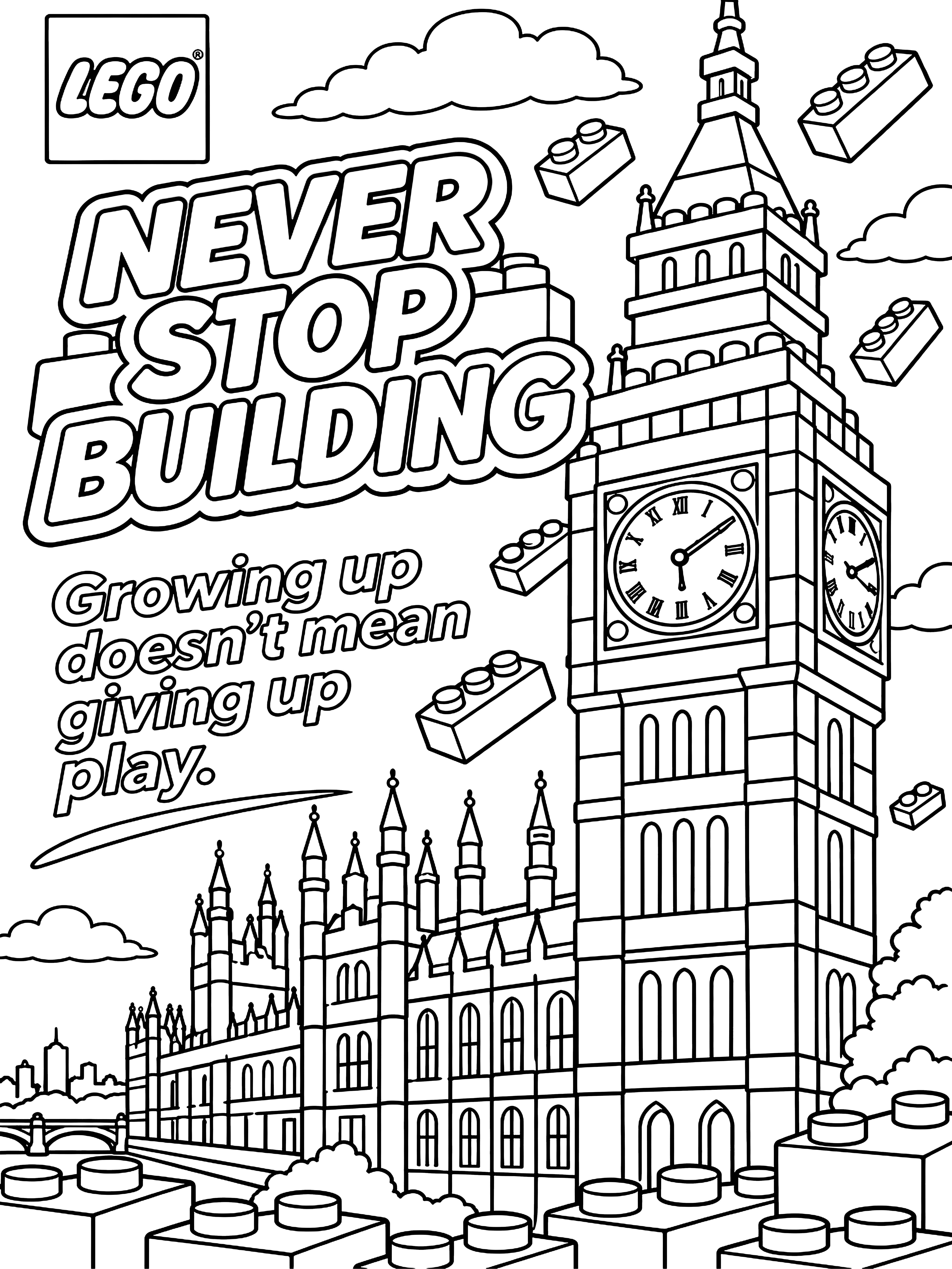
Typography and colour
I tried different types of lettering to see which fit the LEGO theme and were easiest to read. I used red, yellow and blue because they’re the LEGO colours I remember growing up with and they stood out in the adverts I looked at. I made “Never Stop Building” yellow and red to echo the LEGO logo and make the lettering look like part of the bricks. I chose white for the individual slogans so they’d stand out against the blue sky.
Final posters
- Big Ben — “Growing up doesn’t mean giving up play.”
- Eiffel Tower — “Imagination doesn’t have an age limit.”
- Pyramids — “We’ve always loved building things.”
The 2025 LEGO advert with Tom Holland inspired the idea of remembering to play as we get older.
Animation
I exported the Photoshop layers to After Effects to make short animations. In the looping versions, the floating bricks bob while the posters stay easy to read.
Self-evaluation
I’m happy with how the posters turned out. I think the half-and-half idea comes across most clearly on the pyramids because you can see the stone blocks turn into LEGO bricks as you look across the poster. If I did the project again, I’d print a test of each poster and look at it from further away to check whether the smaller slogans are easy to read and whether the half-LEGO idea comes across on all three.